Strength from the inside
Challenge
Since 2022, Jude has been raising the bar for bladder health. As a challenger brand in incontinence support, it has built a strong community of women navigating a sensitive and often overlooked issue.
Today, women are increasingly taking their health into their own hands, seeking solutions that address the root cause (not just the symptom) and looking to brands that feel confident, expert and truly effective.
This defiant shift in health ownership, combined with the launch of Jude’s new science backed, game-changing pelvic floor supplements, signalled it was time for the brand to enter the next phase of its visual identity.
How can design help Jude move into her power?
Solution
Our strategy was to shift Jude from an incontinence brand into the science led authority in bladder health. The design idea, Science for Living, captures this evolution - positioning Jude as a brand that uses clinical expertise to build resilience and inner strength.
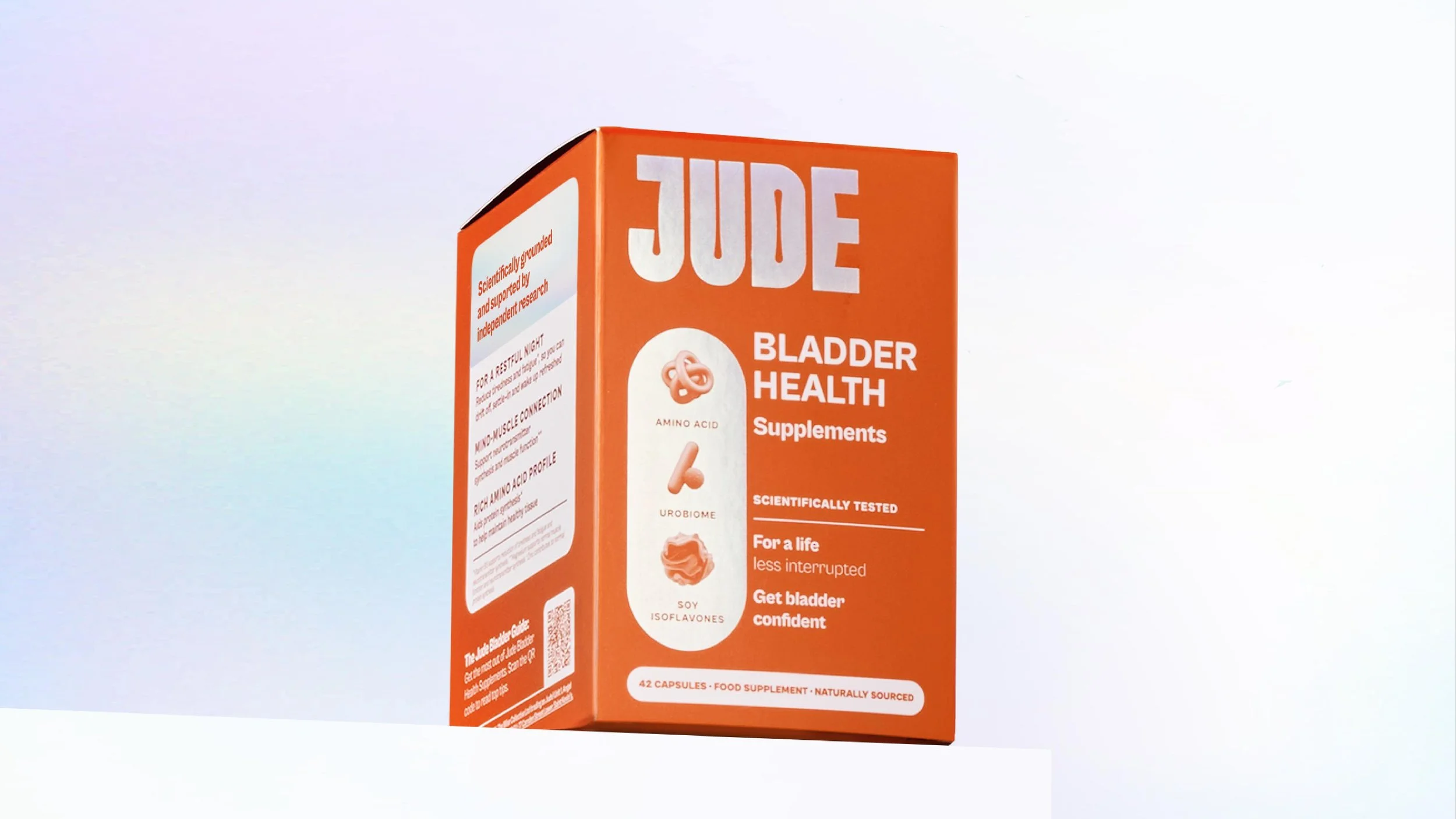
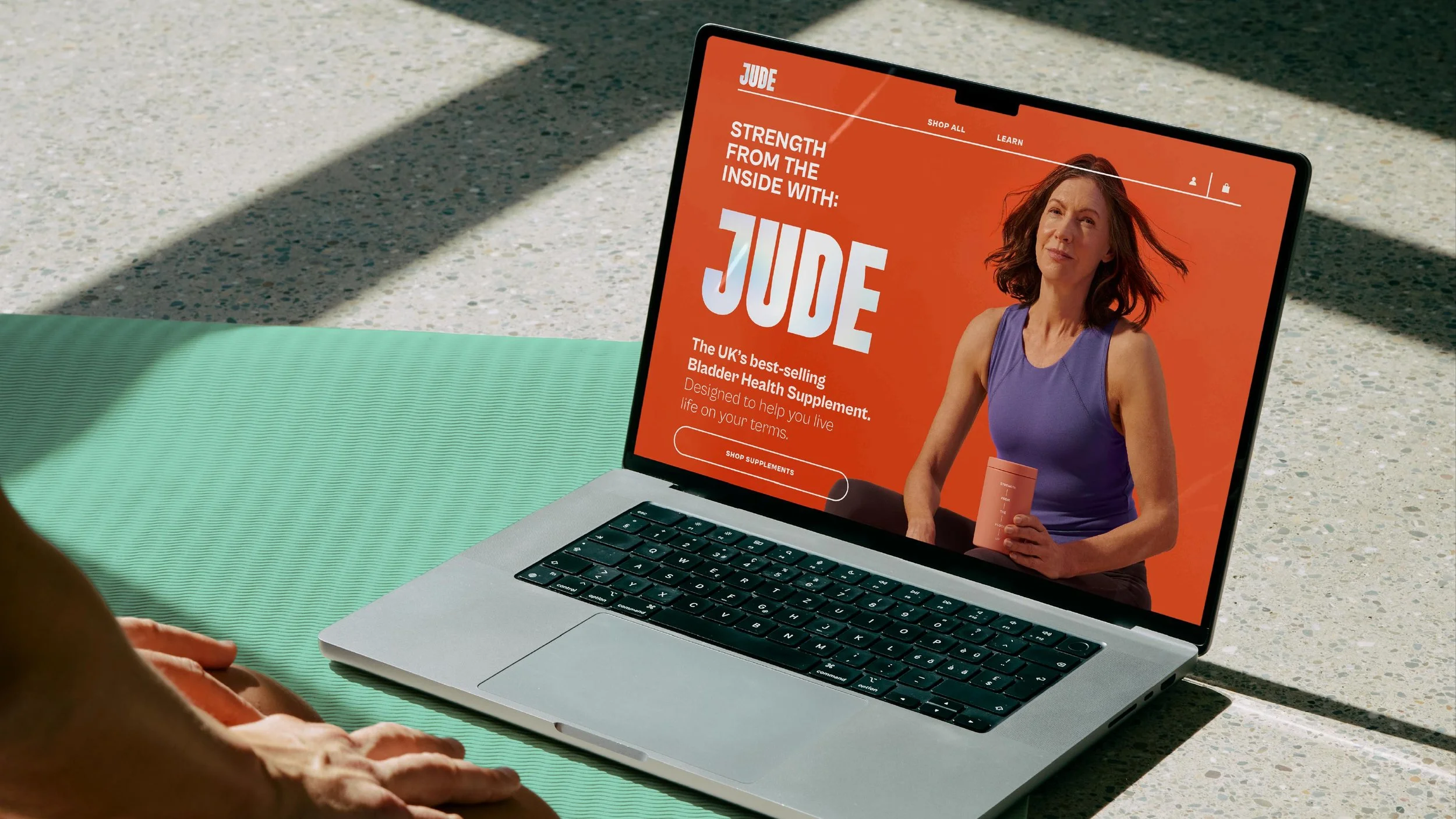
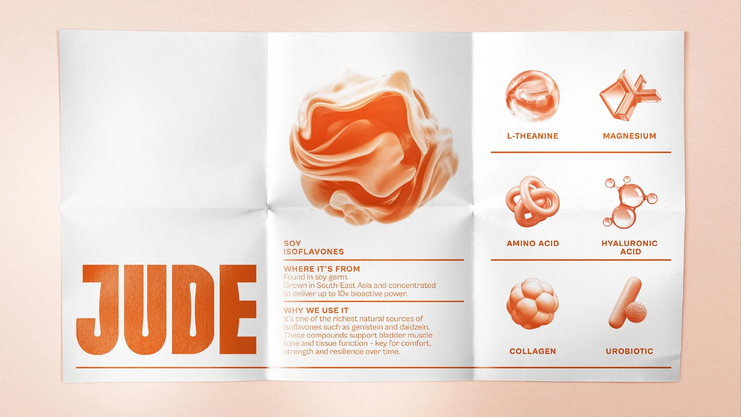
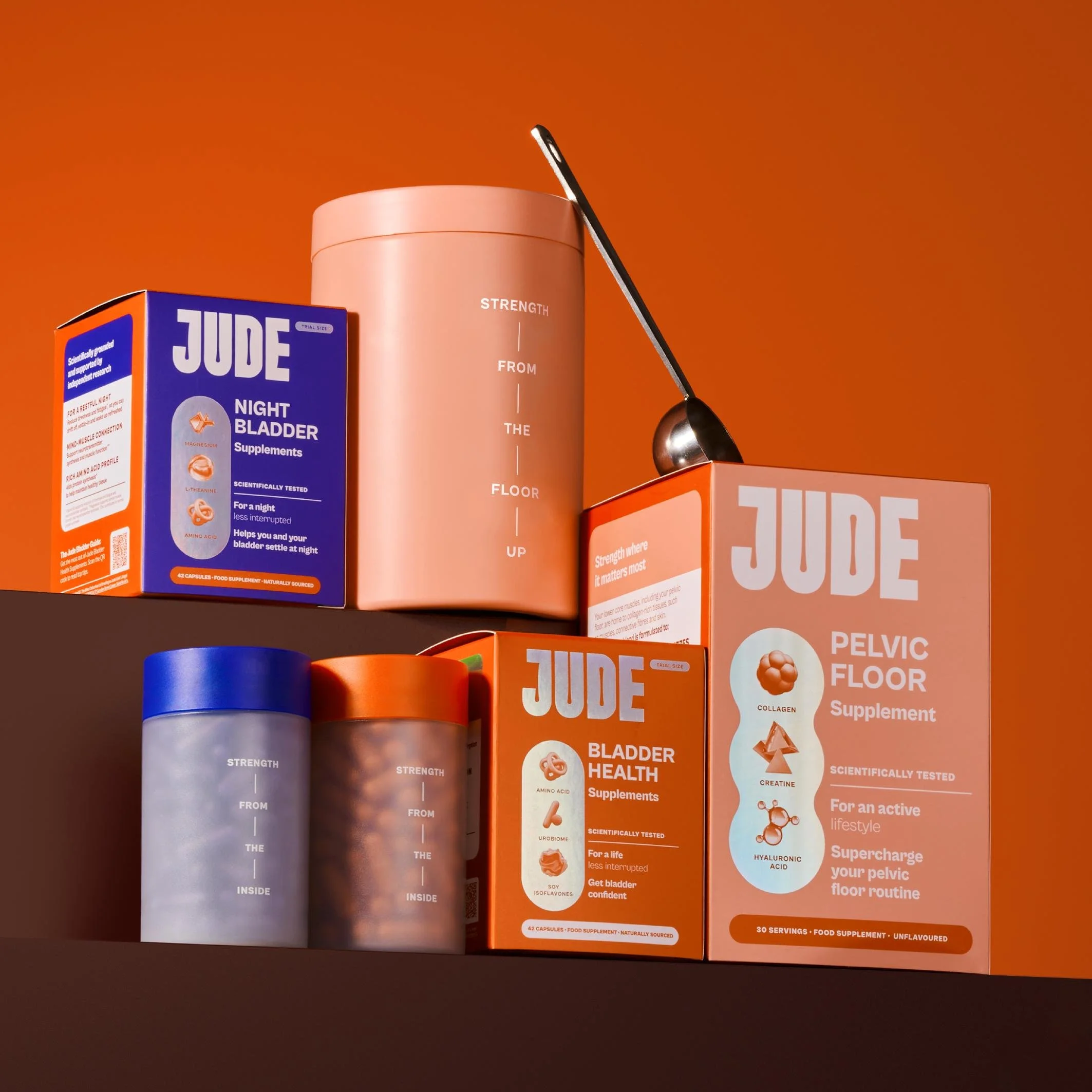
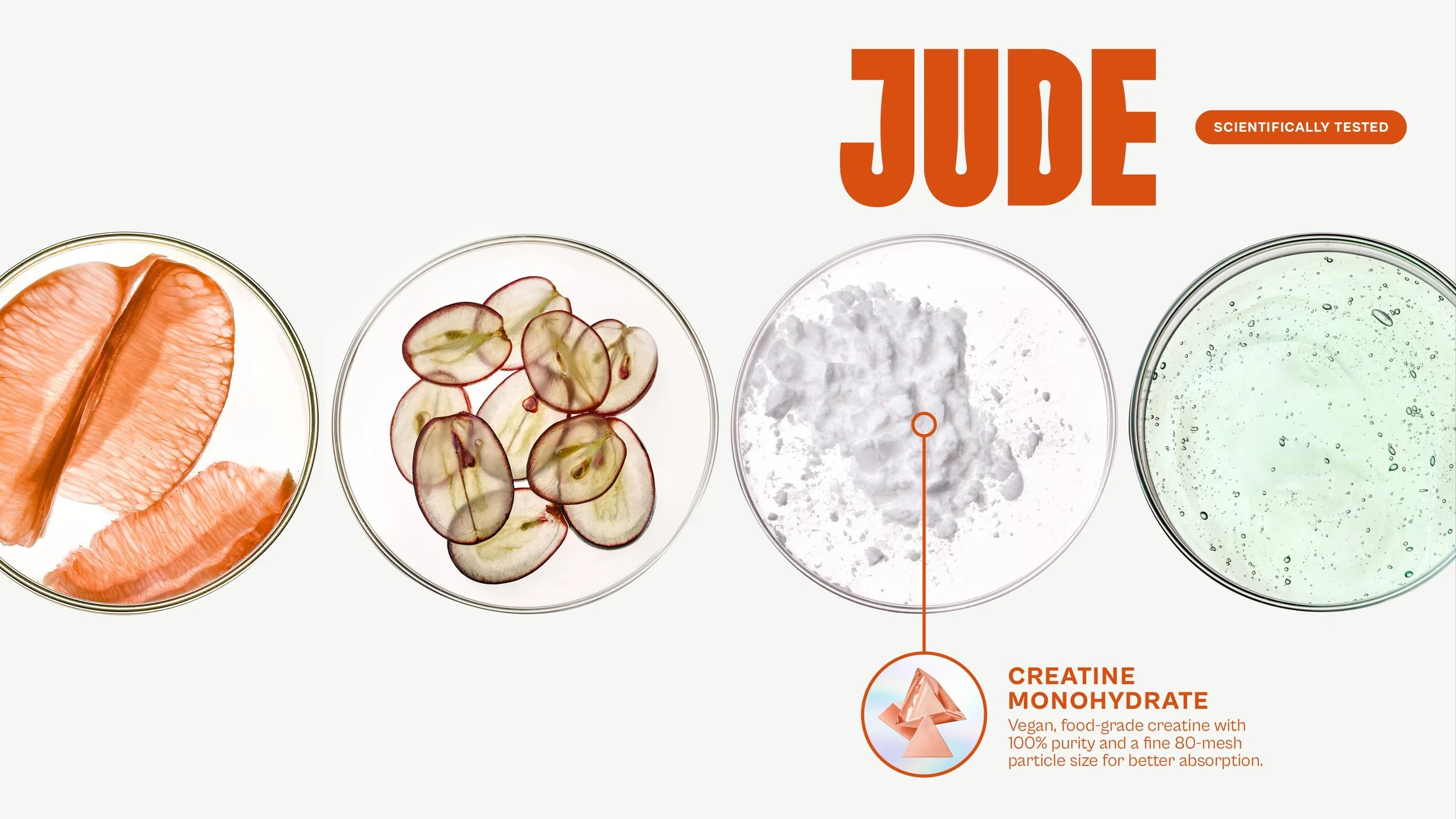
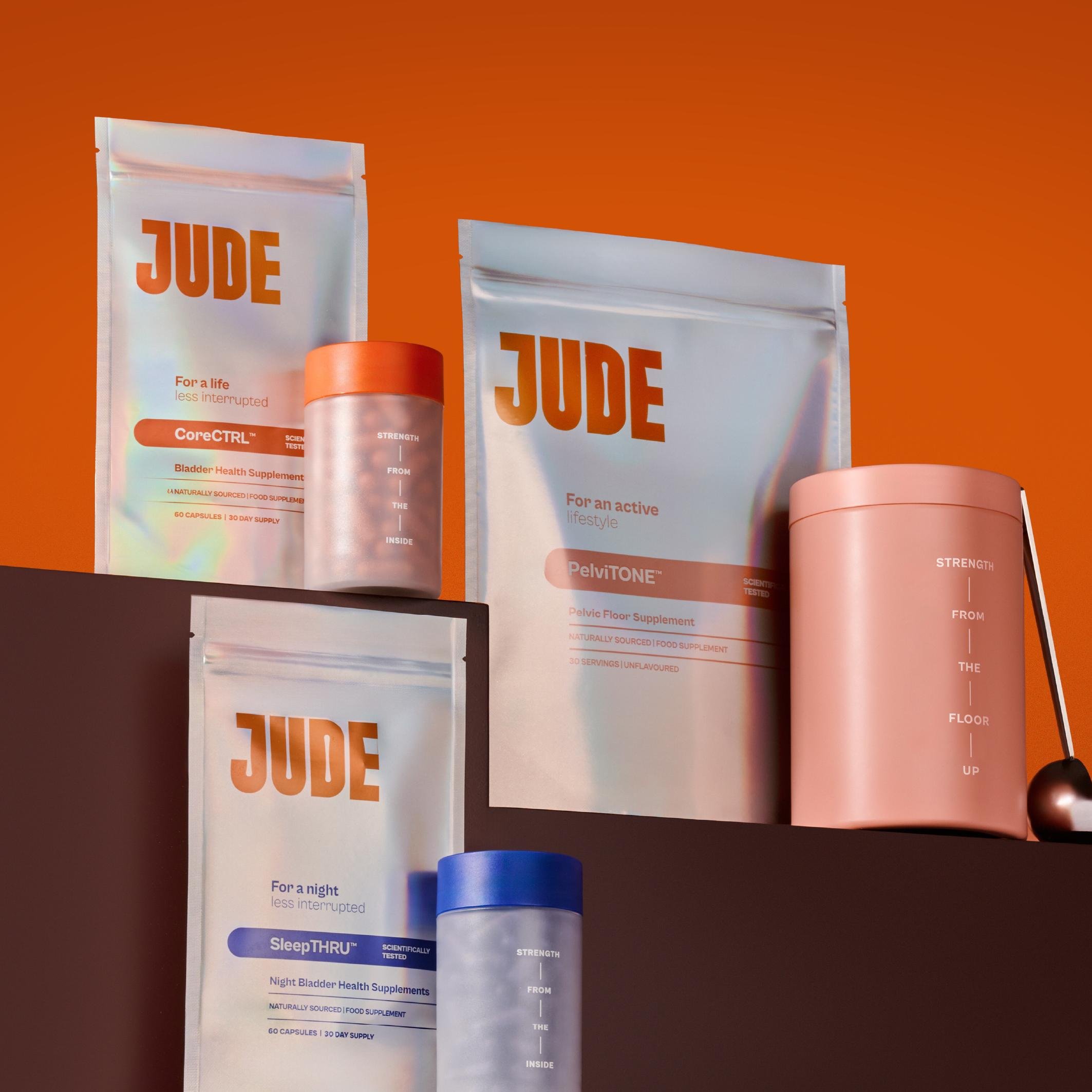
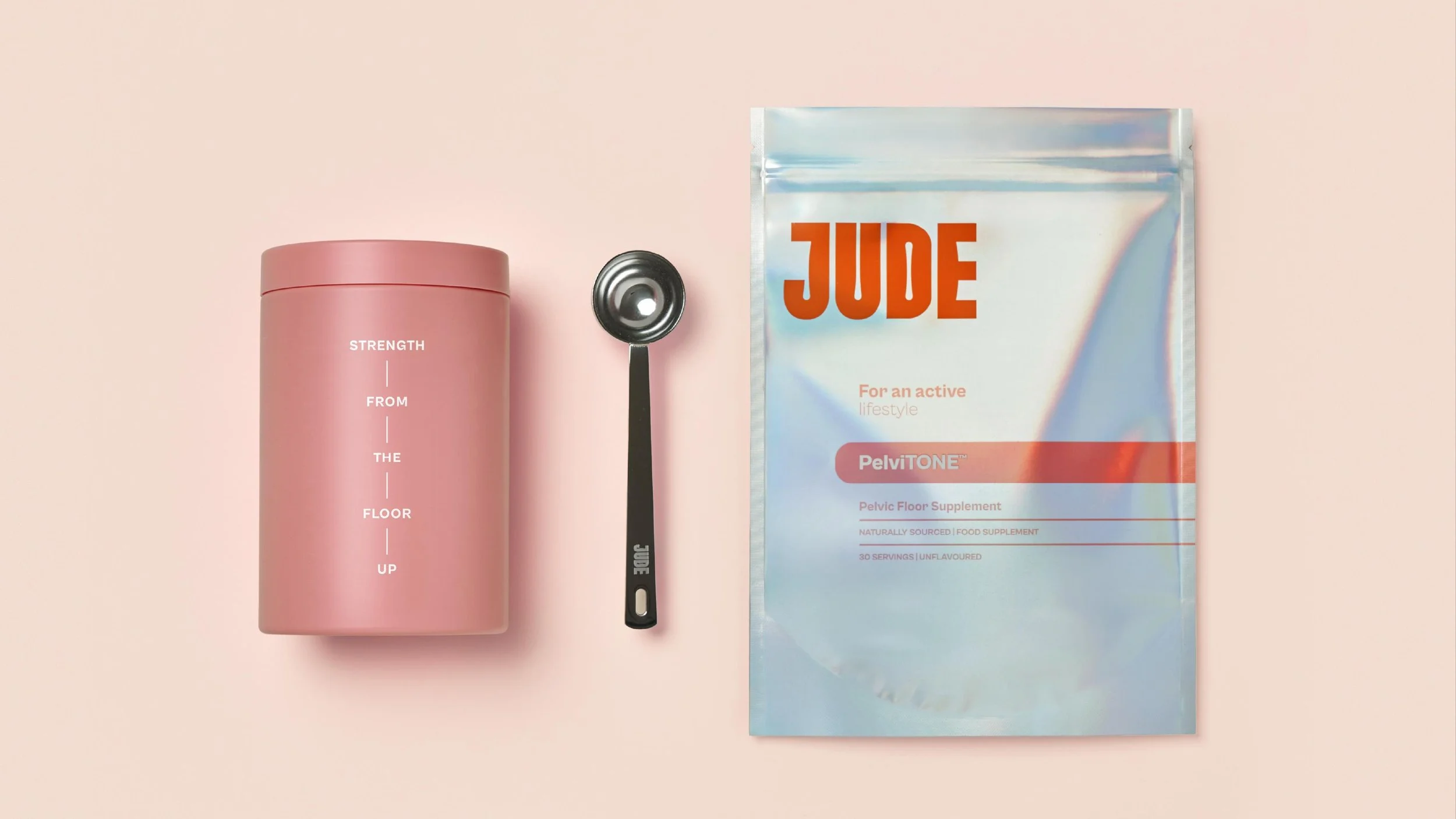
The wordmark evolved into confident capitals with muscular forms, the orange became a deeper, more premium shade with greater impact at shelf, and a system of 3D ingredient icons now makes the science and potency clear.
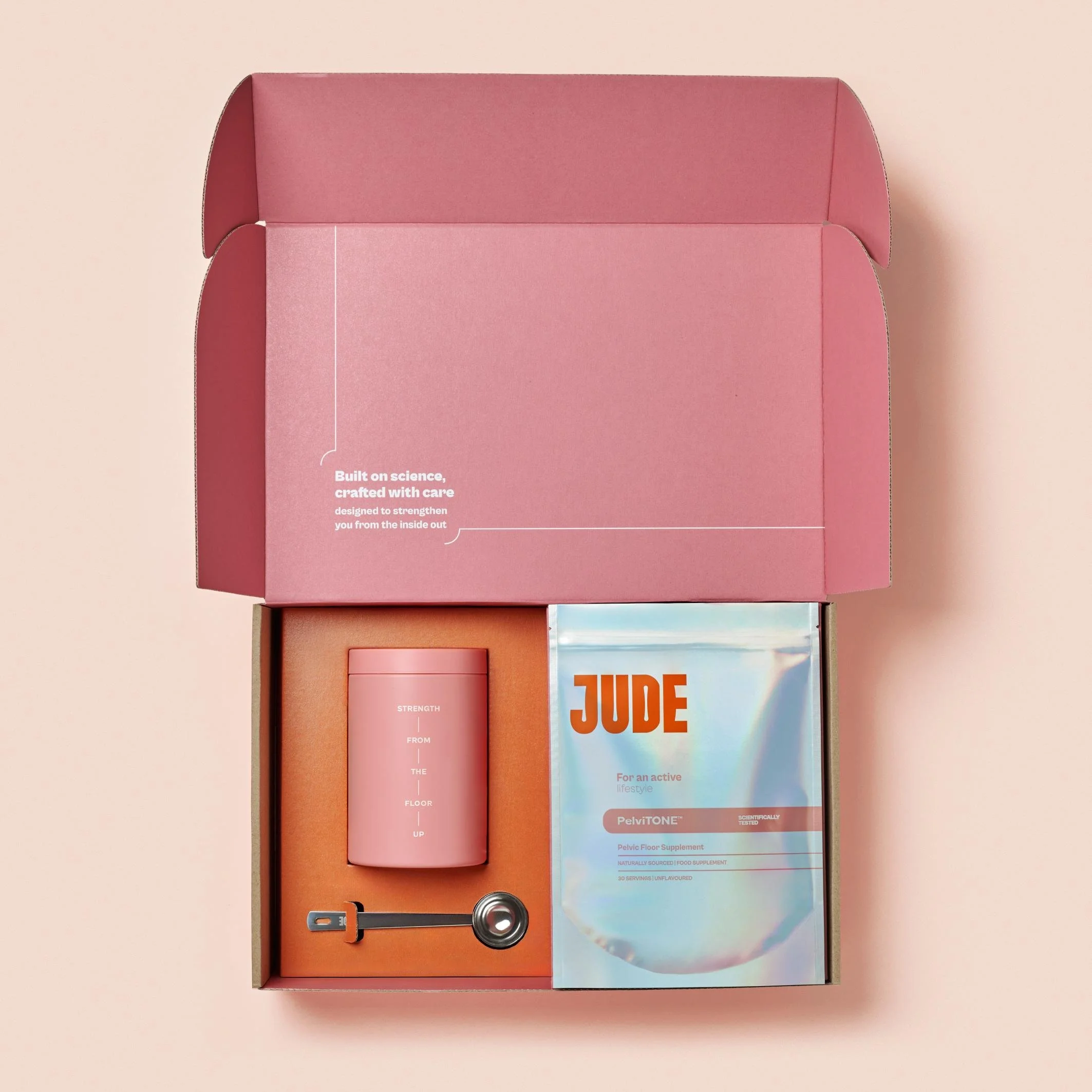
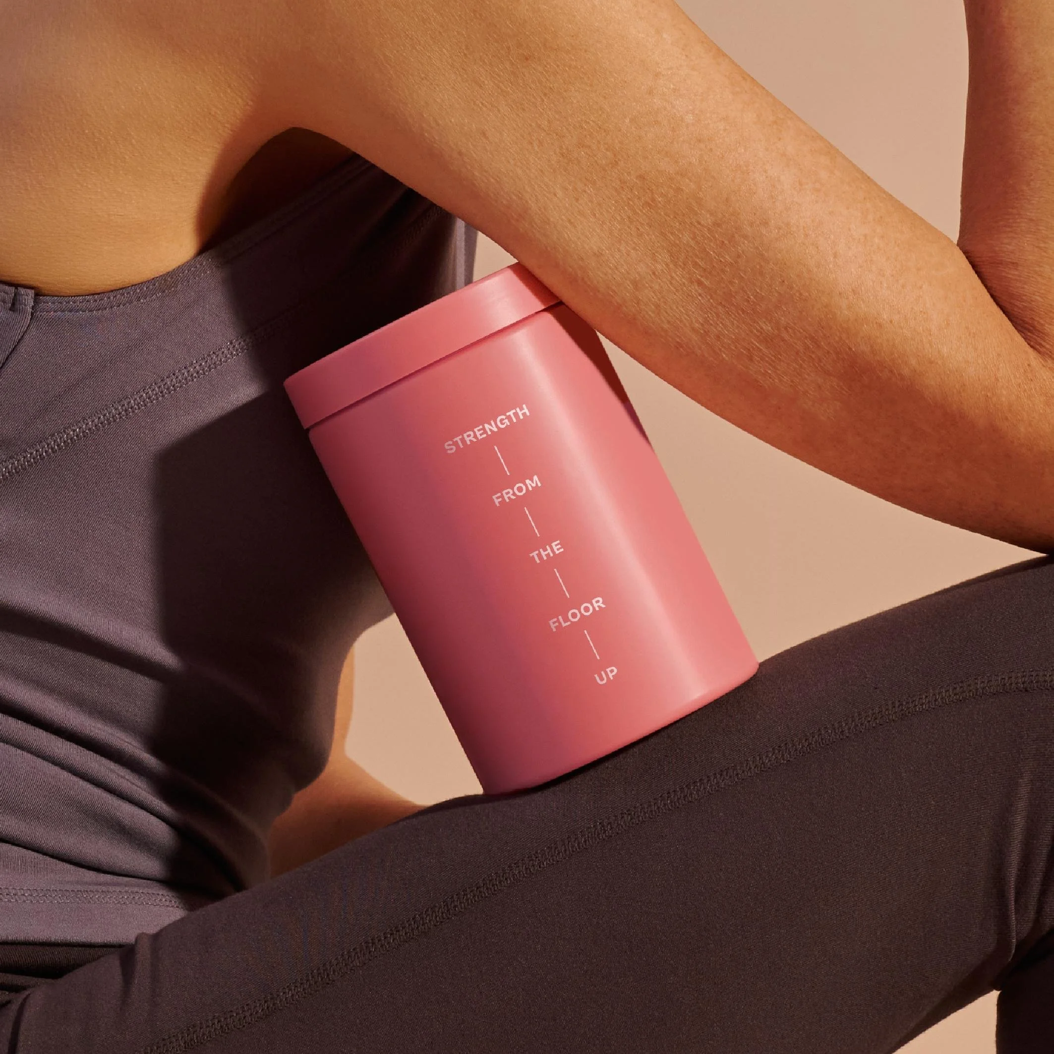
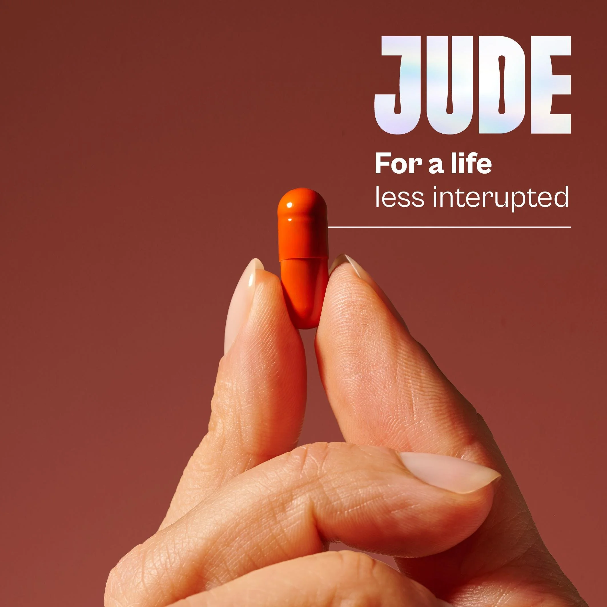
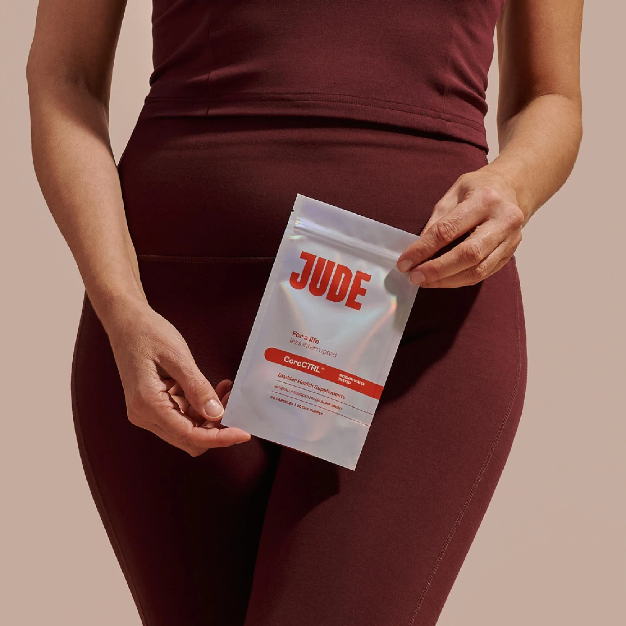
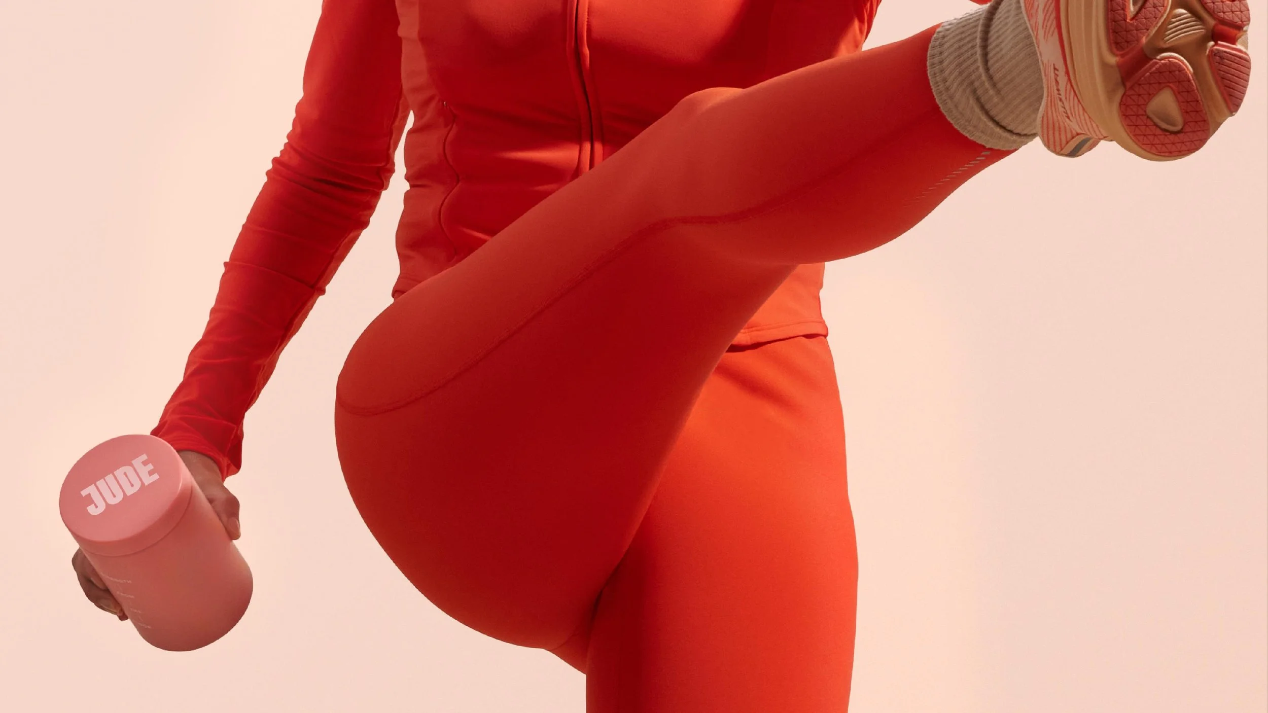
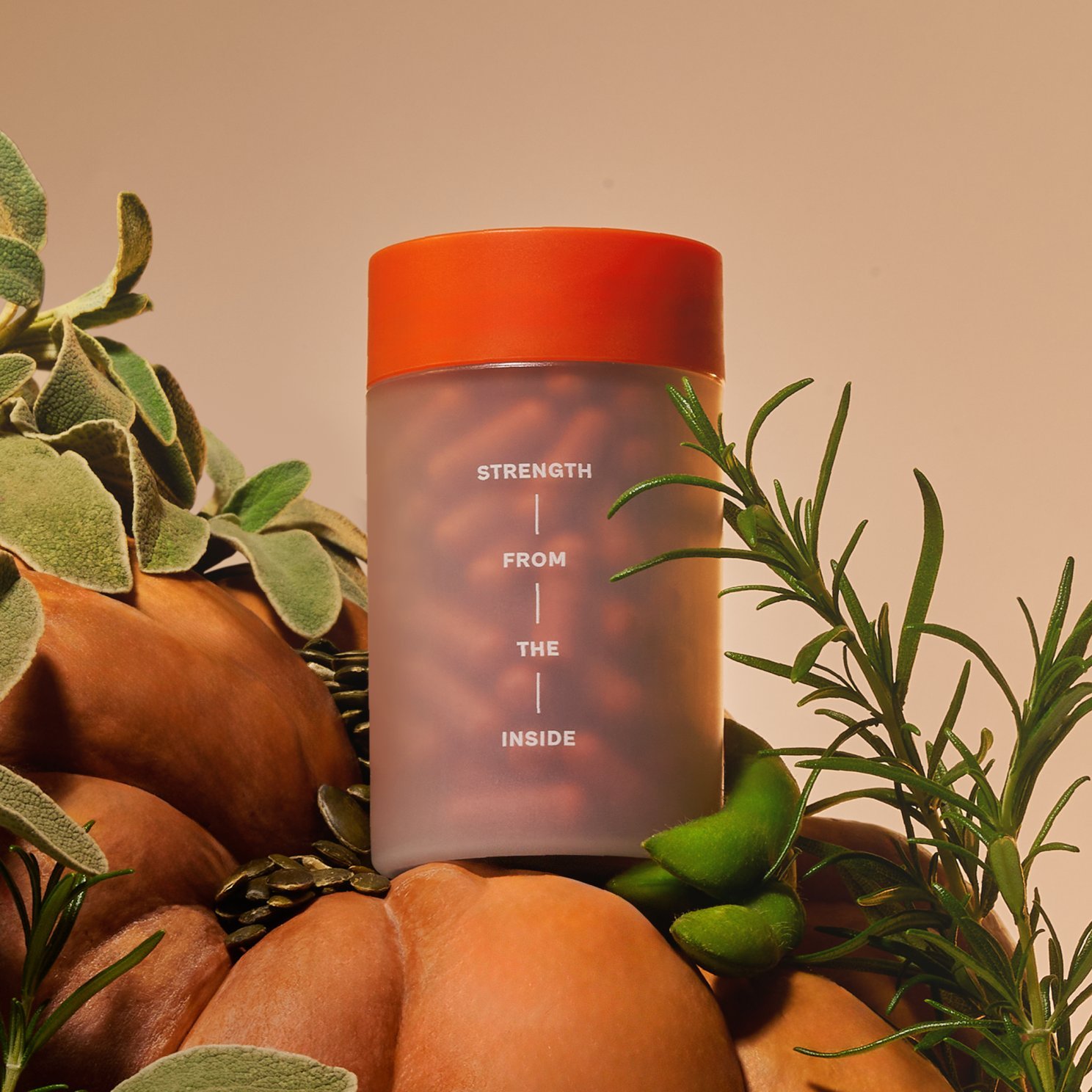
Finally, inspired by the power of the pelvic floor which carries over 100kg a day, we introduced the brand line 'Strength from the Inside'. In a category long defined by embarrassment, Jude now shows up as a bold, modern and empowering voice.
Skillset
Brand Strategy
Brand Identity
Typography
Art Direction
Packaging
Iconography
Playfully proper
-
Since 2022, Jude has been raising the bar for bladder health. As a challenger brand in incontinence support, it has built a strong community of women navigating a sensitive and often overlooked issue.
Today, women are increasingly taking their health into their own hands, seeking solutions that address the root cause (not just the symptom) and looking to brands that feel confident, expert and truly effective.
This defiant shift in health ownership, combined with the launch of Jude’s new science backed, game-changing pelvic floor supplements, signalled it was time for the brand to enter the next phase of its visual identity.
How can design help Jude move into her power?
-
Our strategy was to shift Jude from an incontinence brand into the science led authority in bladder health. The design idea, Science for Living, captures this evolution - positioning Jude as a brand that uses clinical expertise to build resilience and inner strength.
The wordmark evolved into confident capitals with muscular forms, the orange became a deeper, more premium shade with greater impact at shelf, and a system of 3D ingredient icons now makes the science and potency clear.
Finally, inspired by the power of the pelvic floor which carries over 100kg a day, we introduced the brand line 'Strength from the Inside'. In a category long defined by embarrassment, Jude now shows up as a bold, modern and empowering voice.
-
Brand Strategy
Brand Identity
Typography
Art Direction
Packaging
Iconography
“Derek&Eric truly understood our ambition to become the authority in bladder health and translated that into a brand world that feels confident, expert and powerful.
The new identity has elevated everything. We look stronger, more credible and more impactful at shelf. The team brought strategic clarity and exceptional creativity.”
Peony Li
Founder & CEO, Jude

Recognition
Partners
Client: Jude
Production: The London Artworking Co.
Related projects