A beacon of goodness
Challenge
Since innocent rocketed onto the scene in 1999, they have been defining the fruit drink category – crafting a well loved brand with fresh design and game changing advertising – all the while honouring their commitment to leave things better than they found them.
As the world has changed, so has the innocent portfolio, with an ever evolving line up of innovative products.
But along with growth, the single minded confidence of the original visual identity had been gradually buried under a clutter of disparate styles, resulting in a fractured portfolio with diminished shelf-blocking halo effect.
How can design help a brand reclaim its former glory?
Solution
The design strategy was deceptively simple – go back to first principles and elevate ‘the dude’, as our symbol of goodness, to the stature he always should have had.
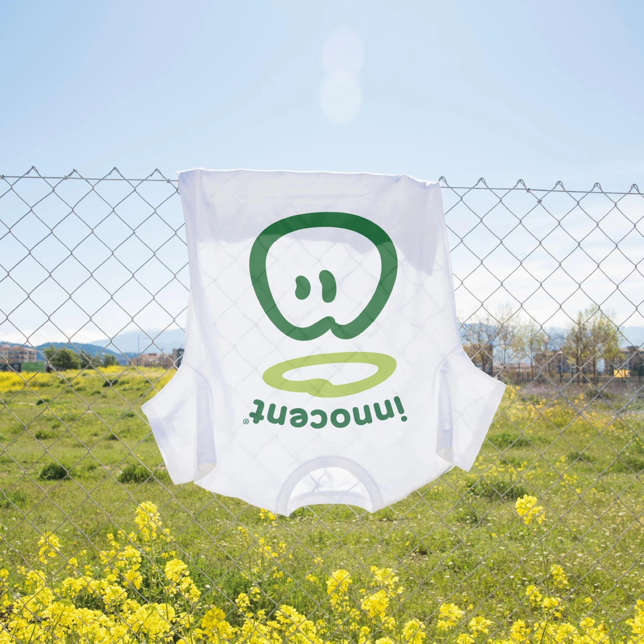
To that end, we began by redrawing the dude himself, smoothing out his italicised form, allowing him to occupy maximum space in every composition and lock up with the newly softened and arched innocent wordmark.
We then stripped back the chaotic variety of every other element – typography, colour, illustration and photography among them – crafting a new core set of key assets. This built a strong but flexible system with clear principles for all current and future ranges – ensuring differentiation without losing distinctiveness.
Keep it simple, smoothie fans!
Skillset
Strategy
Identity
Brand Design
Packaging
A beacon of goodness
-
Since innocent rocketed onto the scene in 1999, they have been defining the fruit drink category – crafting a well loved brand with fresh design and game changing advertising – all the while honouring their commitment to leave things better than they found them.
As the world has changed, so has the innocent portfolio, with an ever evolving line up of innovative products.
But along with growth, the single minded confidence of the original visual identity had been gradually buried under a clutter of disparate styles, resulting in a fractured portfolio with diminished shelf-blocking halo effect.
How can design help a brand reclaim its former glory?
-
The design strategy was deceptively simple – go back to first principles and elevate ‘the dude’, as our symbol of goodness, to the stature he always should have had.
To that end, we began by redrawing the dude himself, smoothing out his italicised form, allowing him to occupy maximum space in every composition and lock up with the newly softened and arched innocent wordmark.
We then stripped back the chaotic variety of every other element – typography, colour, illustration and photography among them – crafting a new core set of key assets. This built into a strong but flexible system with clear principles for all current and future ranges – ensuring differentiation without losing distinctiveness.
Keep it simple, smoothie fans!
-
Strategy
Identity
Brand Design
Packaging


Impact
Response
94%
94% of people say the new packs feel like a cohesive range – with stronger brand unity across shelf.
Perception
+9%
Premium perception up, with a rise from 22% to 31% of people saying its ‘worth paying more for’.
Intent
86%
Purchase intent has risen – with 86% of people saying that they would buy the new packs.
Findability
+6%
An average increase of +6% in findability across all key SKU’s.


“The dude is back, looking bolder than ever, and our new designs make it easier for people to find what they need. What’s also exciting for me is how we brought this to life - working with a group of incredibly talented creatives in a new, collaborative way.”
Finlay Hogg
Creative Lead, Innocent Drinks


Recognition
Partners
Design - Innocent In House Creative
Strategy - Silas Amos
Craft - Rob Clarke
Lettering - Carol Kemp
Illustration - Laura Silveira
Motion - Leon Nikoo
Related projects