Simply irresistible
Challenge
Founded in 2004, Gü’s innovative identity cut through the competition, helping to bring their vision of indulgent, restaurant style desserts into the home.
Today, Gü has an enviable level of recognition, with iconic products such as the 5 layer Zillionaire Cheesecake firmly established as national favourites.
But over the years, iterative design evolution has led to a disparate and confusing portfolio, lacking the single minded excellence that once dominated the shelves, solidified a rarified status and justified a ‘worth paying more for’ price point.
How can design help a brand to reclaim its rightful place?
Solution
Our design strategy was to reclaim Gü’s distinctive essence in a contemporary way by going back to the start; a time when the brand was unapologetically indulgent and just a little bit cheeky.
We crafted the Gü wordmark, simplifying awkward elements and establishing a more solid foundation to build out from.
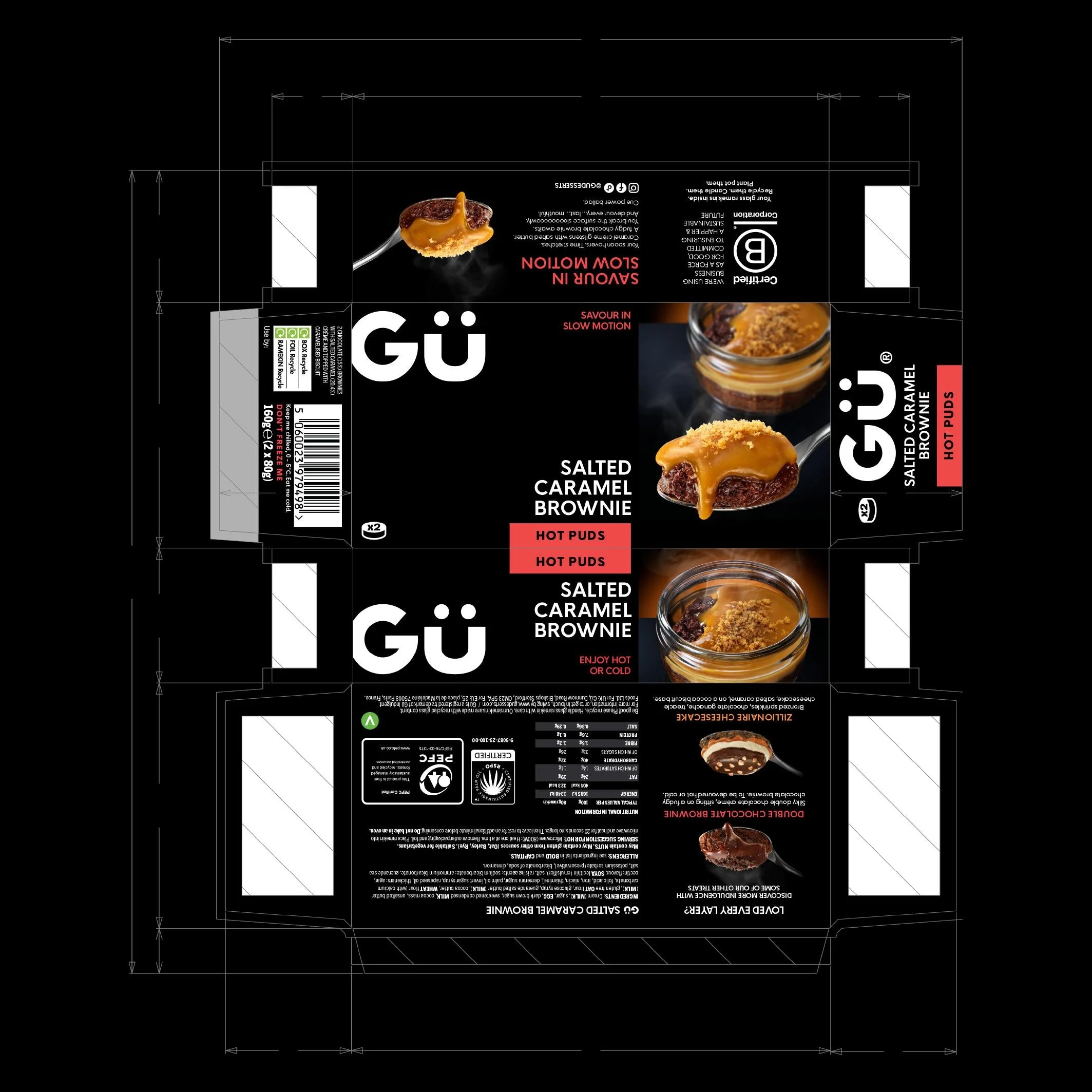
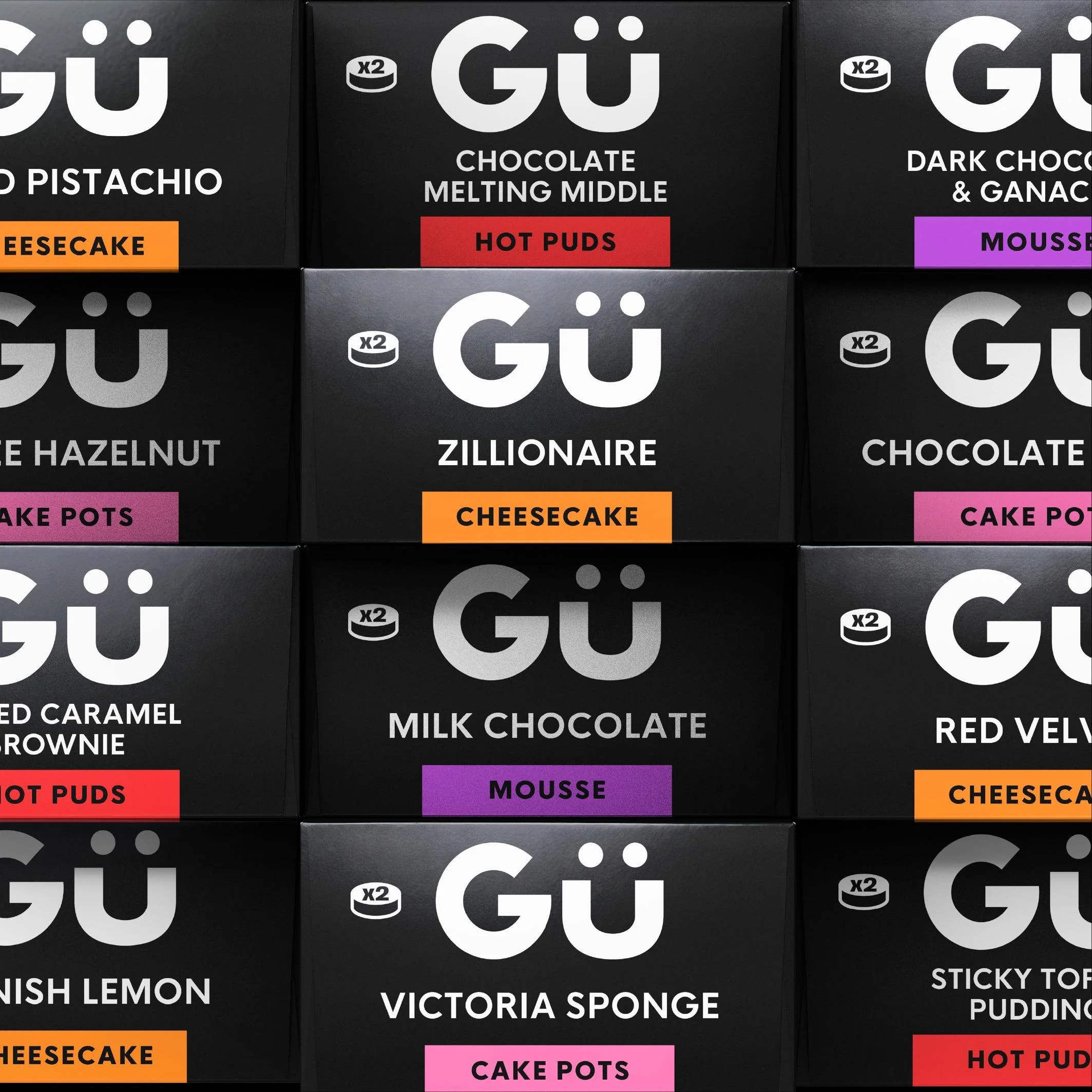
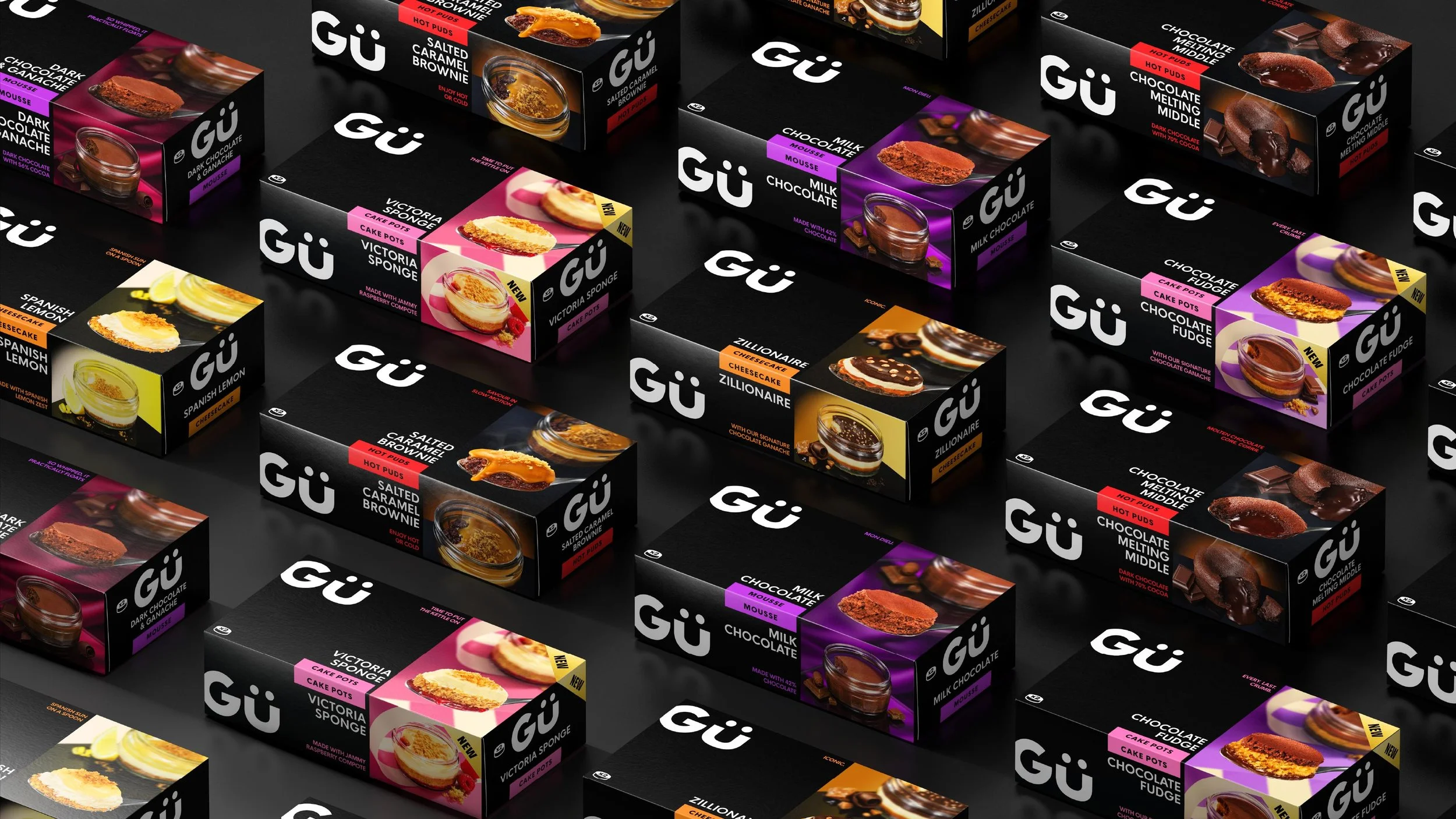
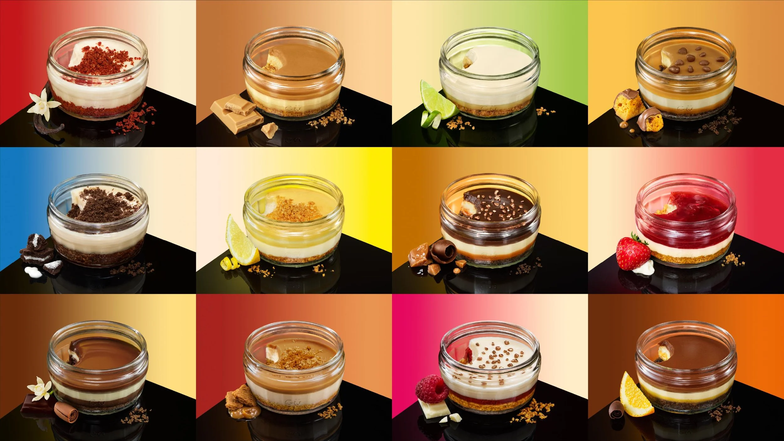
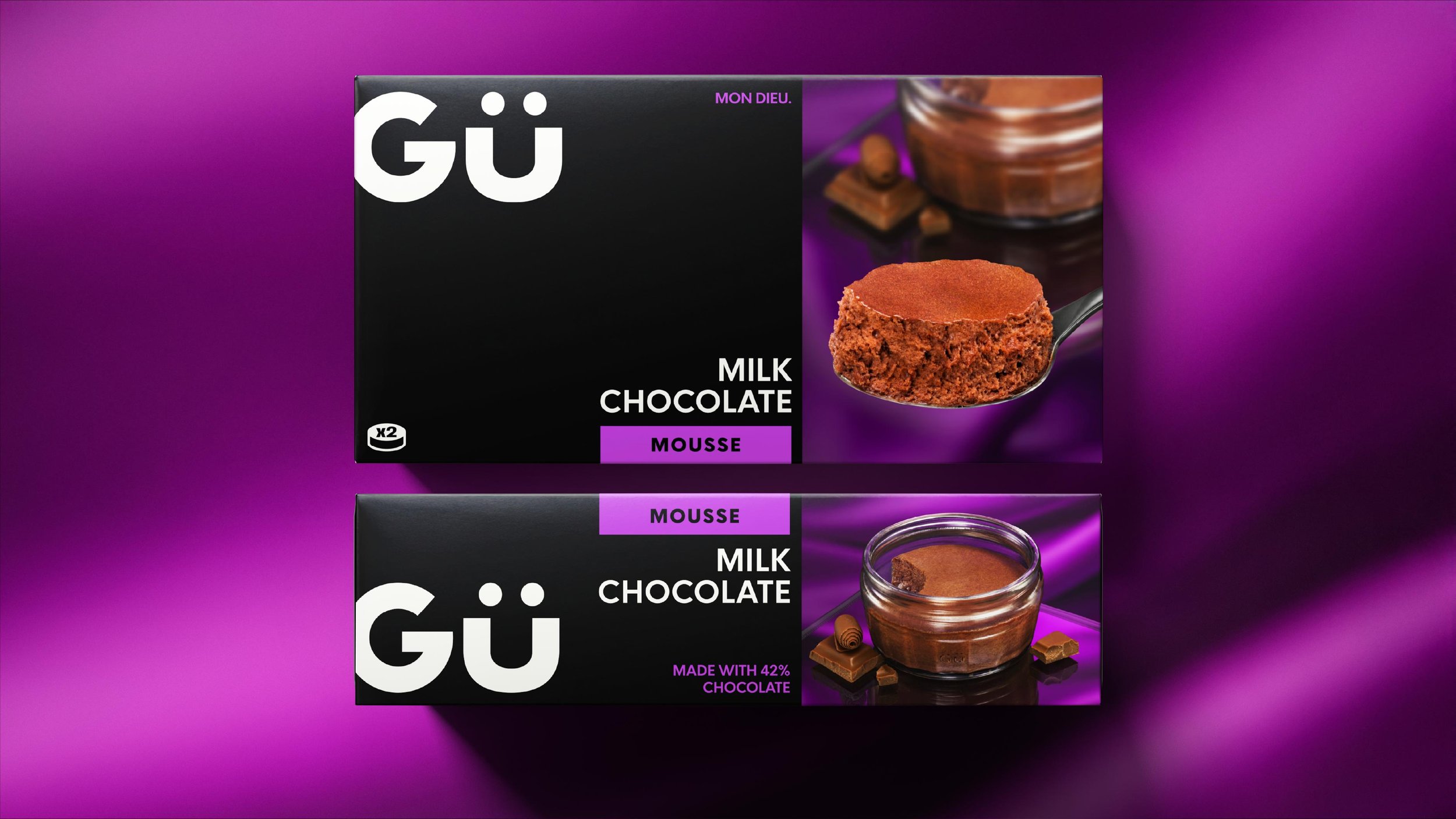
The packaging system rationalises the range, utilising geometric layouts, colourful tabs and a ‘less is more’ sensibility, delivering a considered elegance that aids consumer navigation.
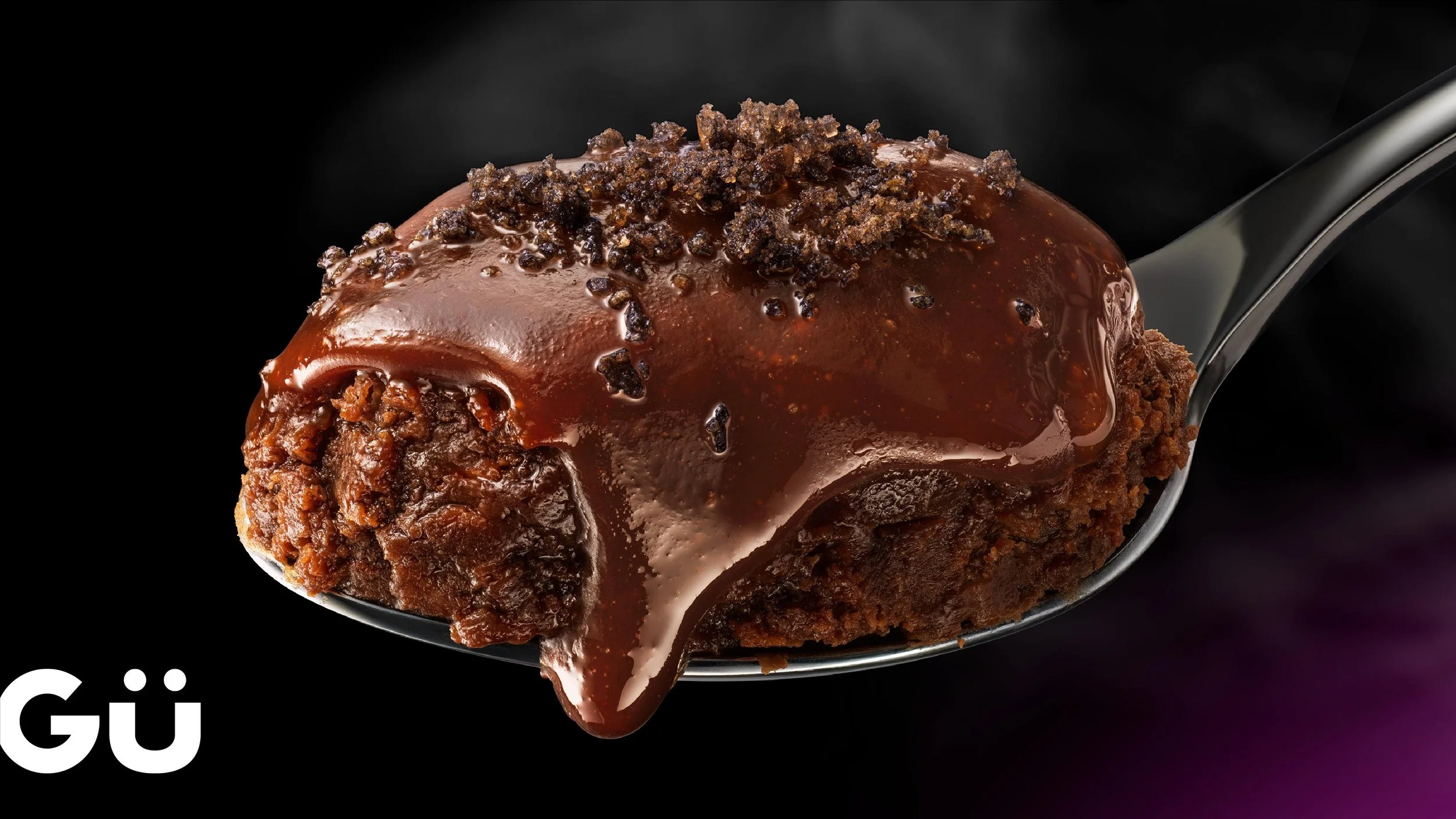
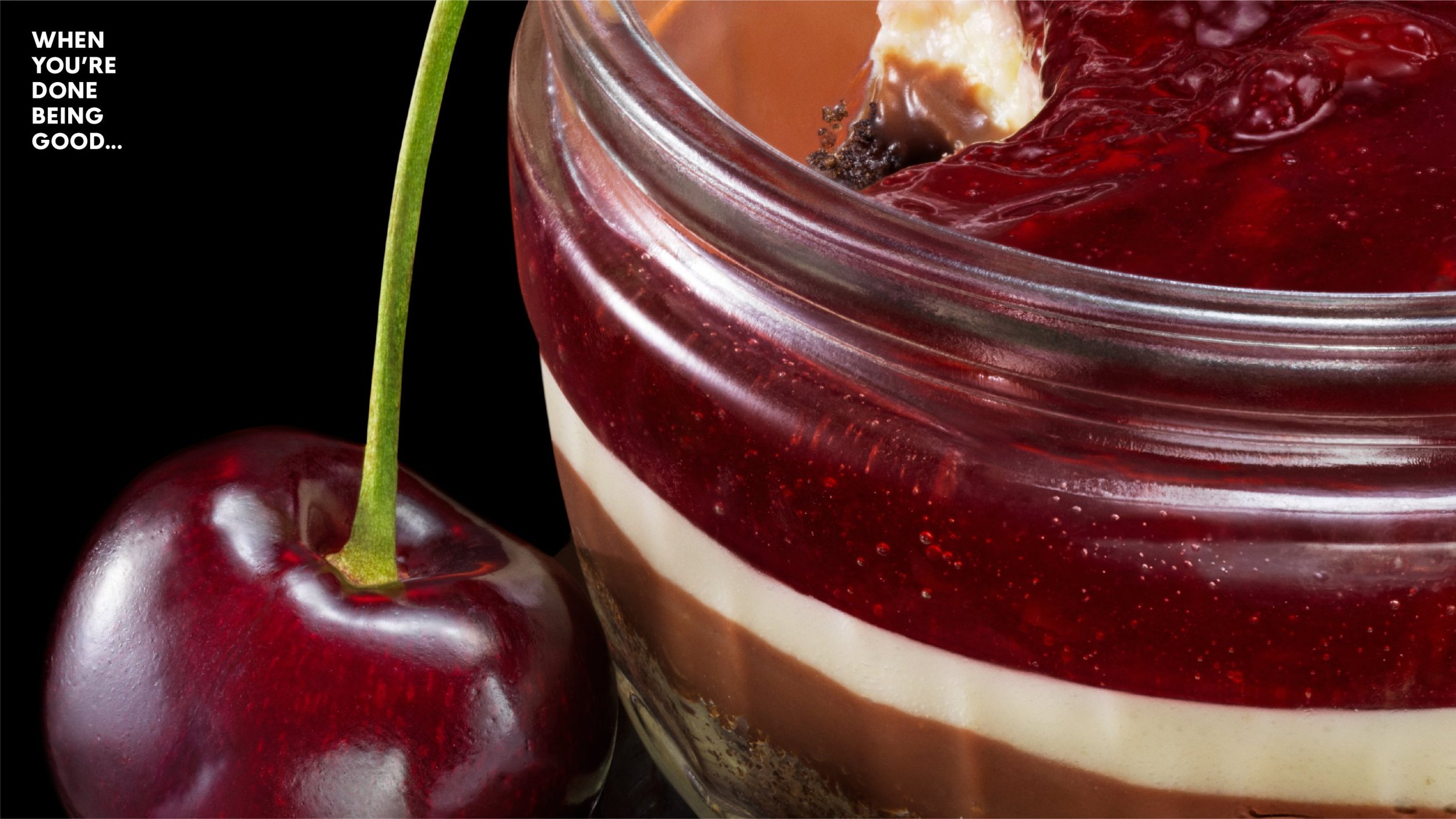
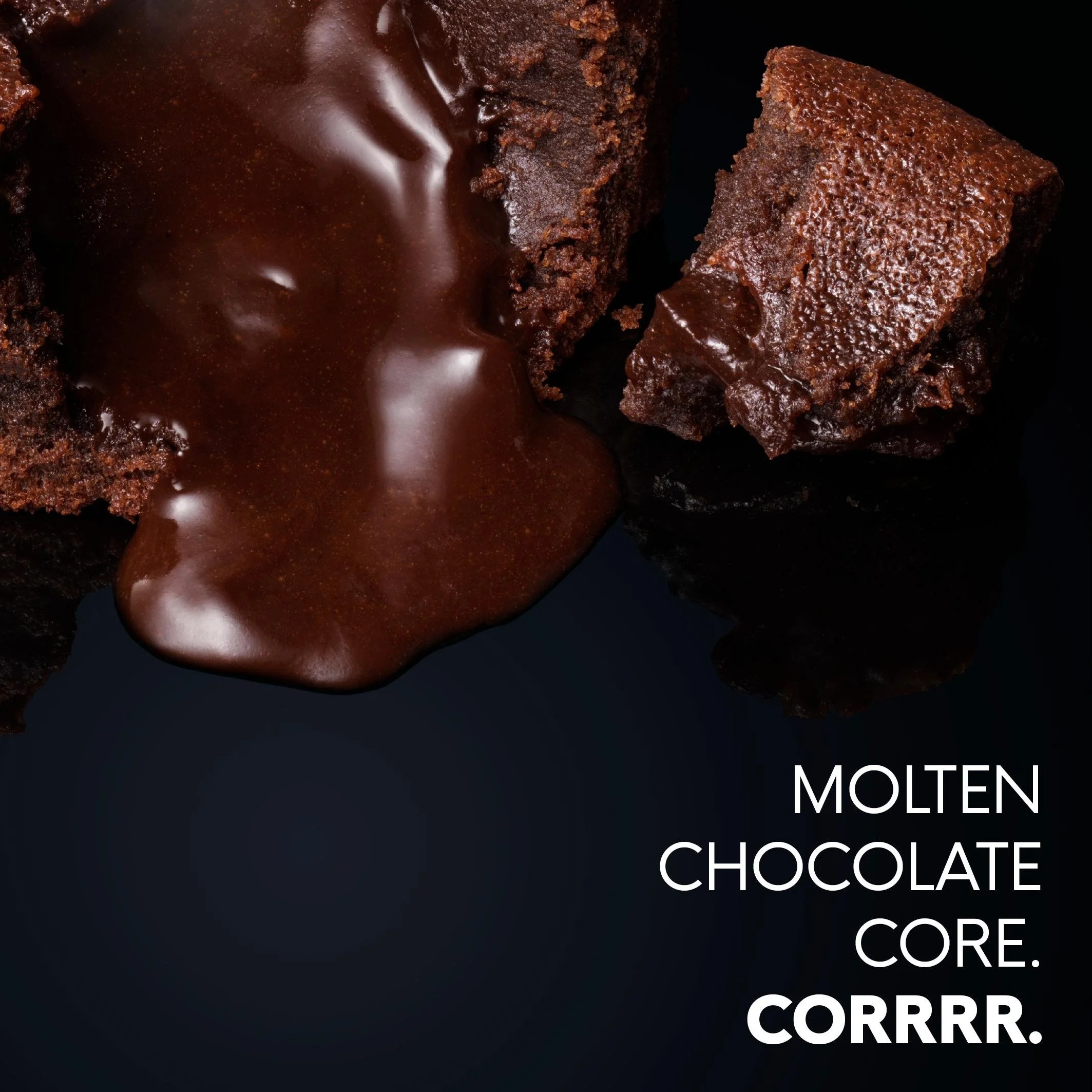
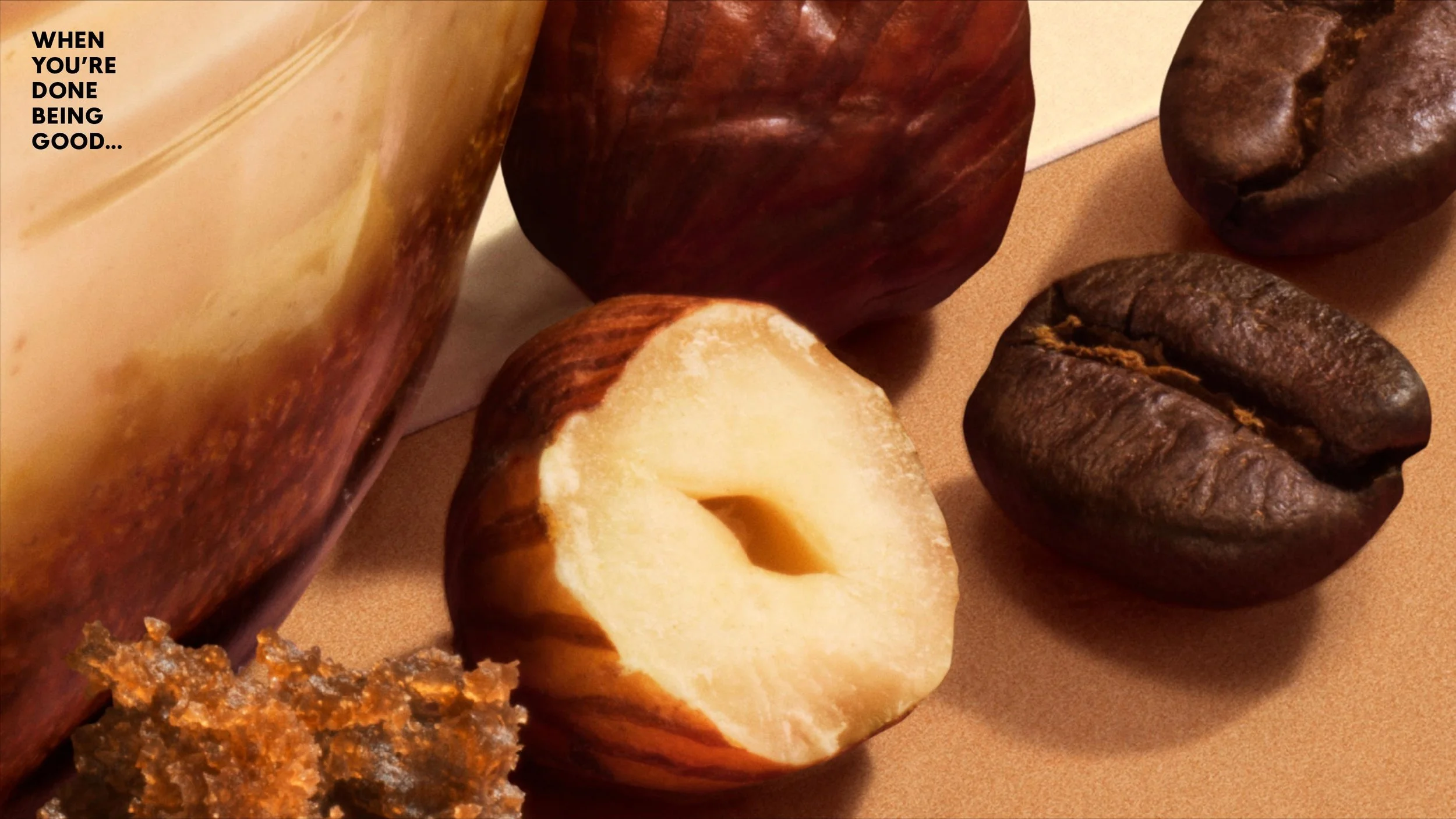
All new photography takes learnings from modern, expressive styles, giving an elevated prominence to the delicious puds themselves, balancing brand recognition and individual stand out with poise.
Simply irresistible.
Skillset
Identity
Brand Design
Packaging
Art Direction
Simply irresistible
-
Founded in 2004, Gü’s innovative identity cut through the competition, helping to bring their vision of indulgent, restaurant style desserts into the home.
Today, Gü has an enviable level of recognition, with iconic products such as the 5 layer Zillionaire Cheesecake firmly established as national favourites.
But over the years, iterative design evolution has led to a disparate and confusing portfolio, lacking the single minded excellence that once dominated the shelves, solidified a rarified status and justified a ‘worth paying more for’ price point.
How can design help a brand to reclaim its rightful place?
-
Our design strategy was to reclaim Gü’s distinctive essence in a contemporary way by going back to the start; a time when the brand was unapologetically indulgent and just a little bit cheeky.
We crafted the Gü wordmark, simplifying awkward elements and establishing a more solid foundation to build out from.
The packaging system rationalises the range, utilising geometric layouts, colourful tabs and a ‘less is more’ sensibility, delivering a considered elegance that aids consumer navigation.
All new photography takes learnings from modern, expressive styles, giving an elevated prominence to the delicious puds themselves, balancing brand recognition and individual stand out with poise.
Simply irresistible.
-
Identity
Brand Design
Packaging
Art Direction


“While consumers love and recognise the Gü brand, and our products remain truly special, over time we have been told the branding has lost some pizazz. With this, and an exciting chapter ahead for us in terms of global growth, now feels like the perfect time for a refresh to ensure we stand out amongst the noise.”
Stefanie Jahn-Hustler
Head of Marketing

Recognition
Partners
Client: Gü
Agency Partner: Joyful & Triumphant
Photography: Barry Makariou
Related projects