Livin’ la vida LatAm
Challenge
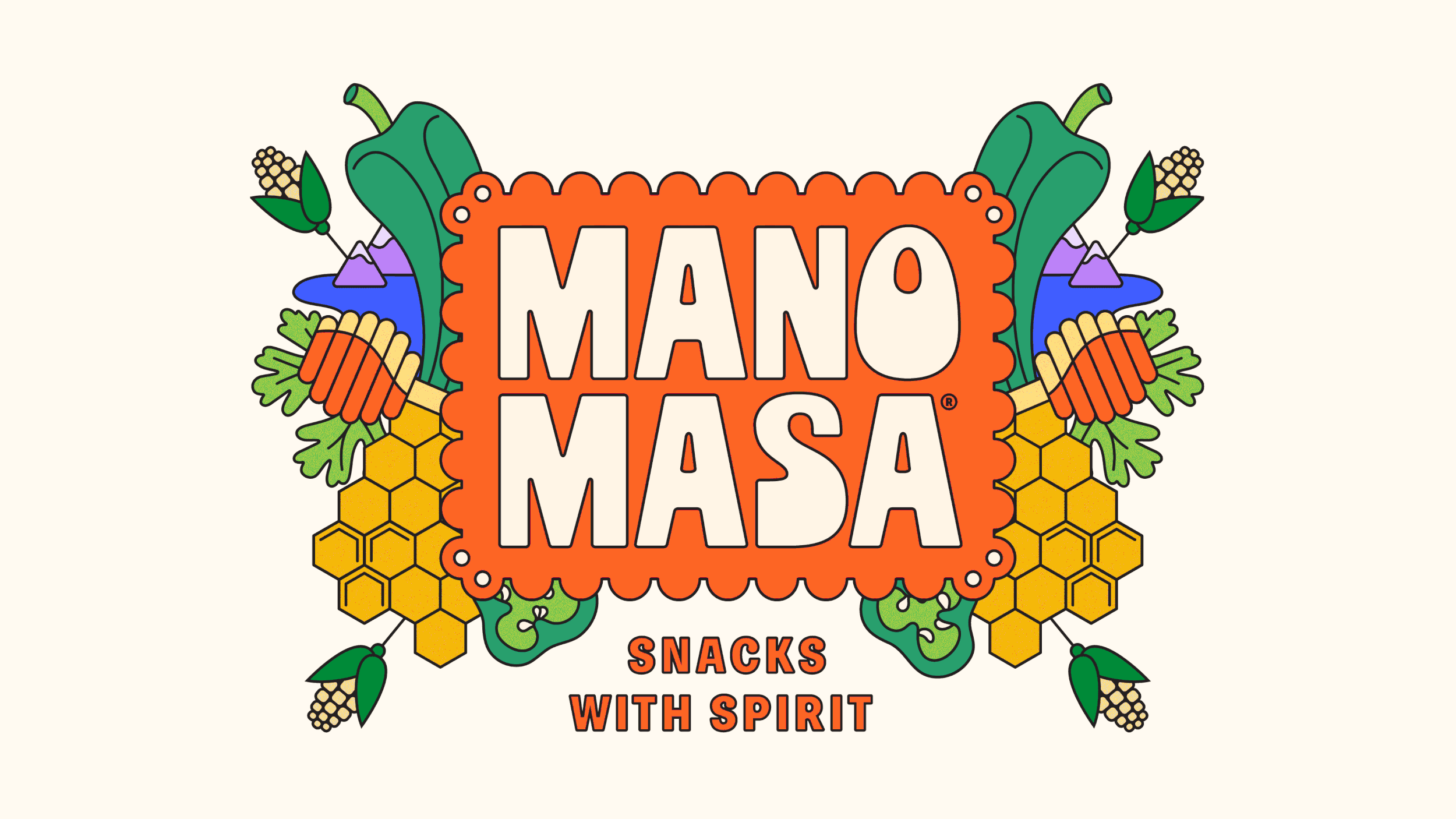
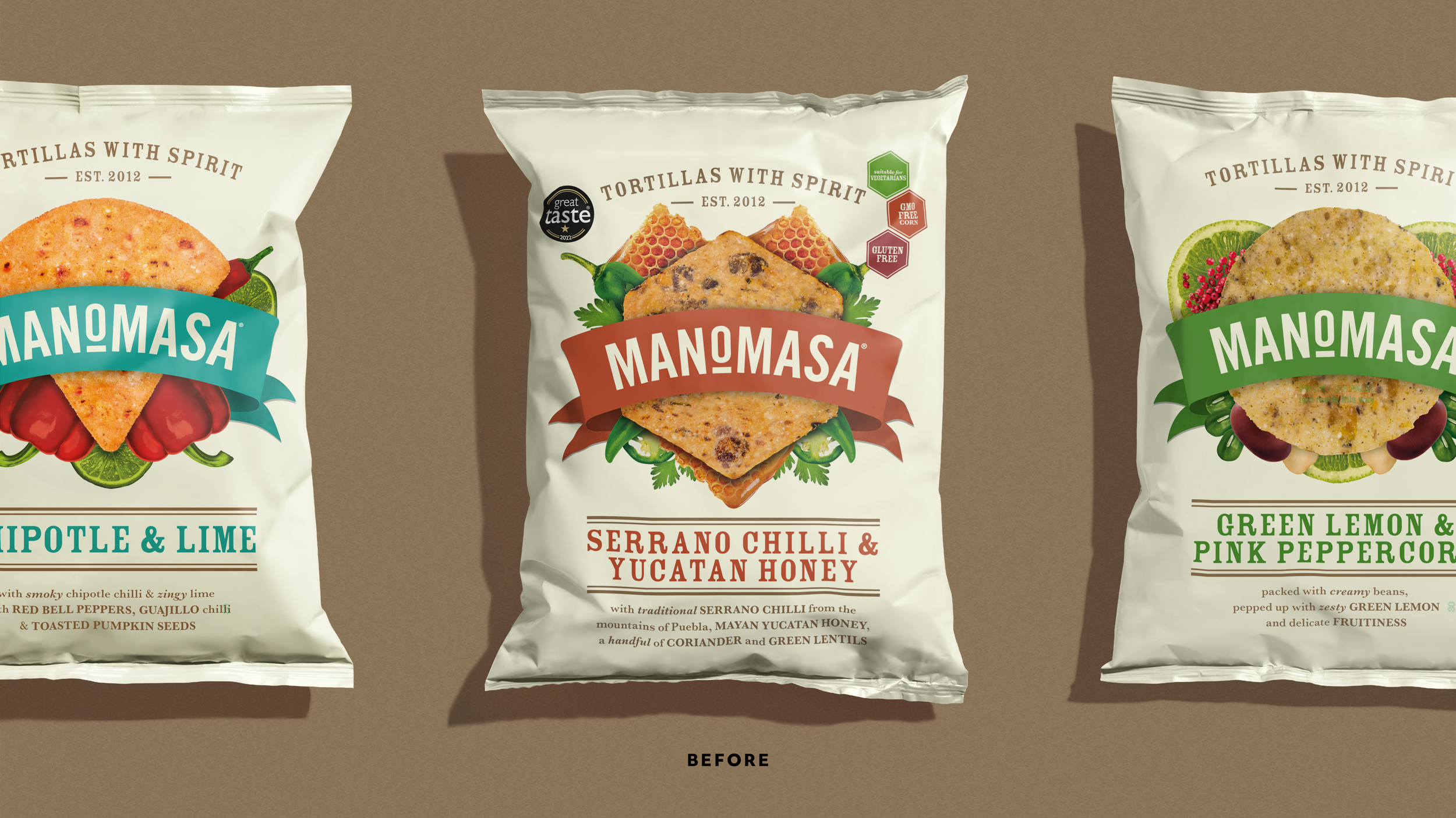
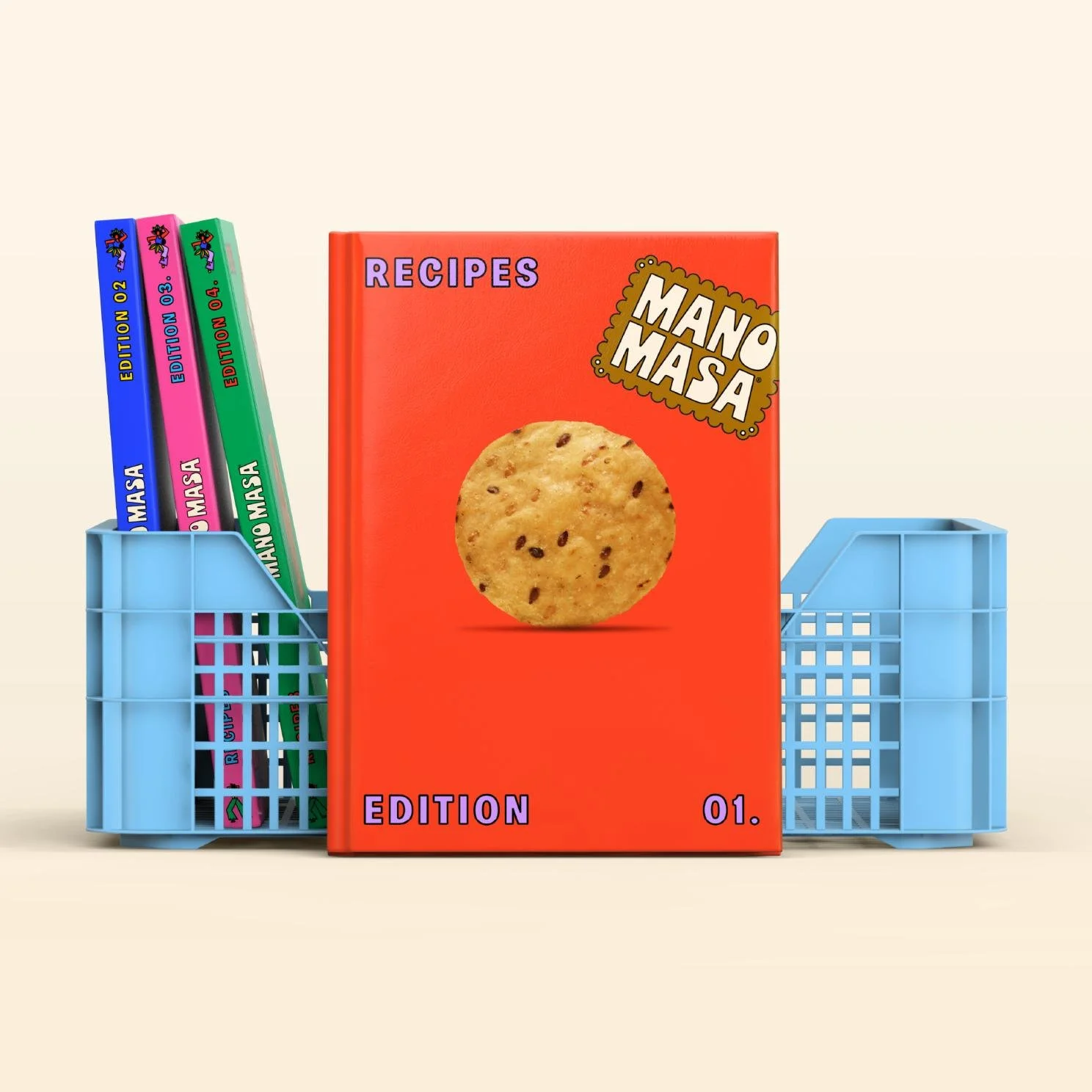
The Manomasa name was created from a Latin American route: ‘Mano’ is Spanish for hand and ‘Masa’ is the maize dough that’s used to make traditional tortilla chips.
Since its launch, the brand has built up a small but dedicated following, who delight in the delicious flavours and exciting textures found across the range.
But despite this fanbase, the brand was struggling to make headway beyond its position as one of many wholesome ’farm shop-esque’ snack brands found in premium retailers.
How can design be used to break a brand out of a niche and into the mainstream?
Solution
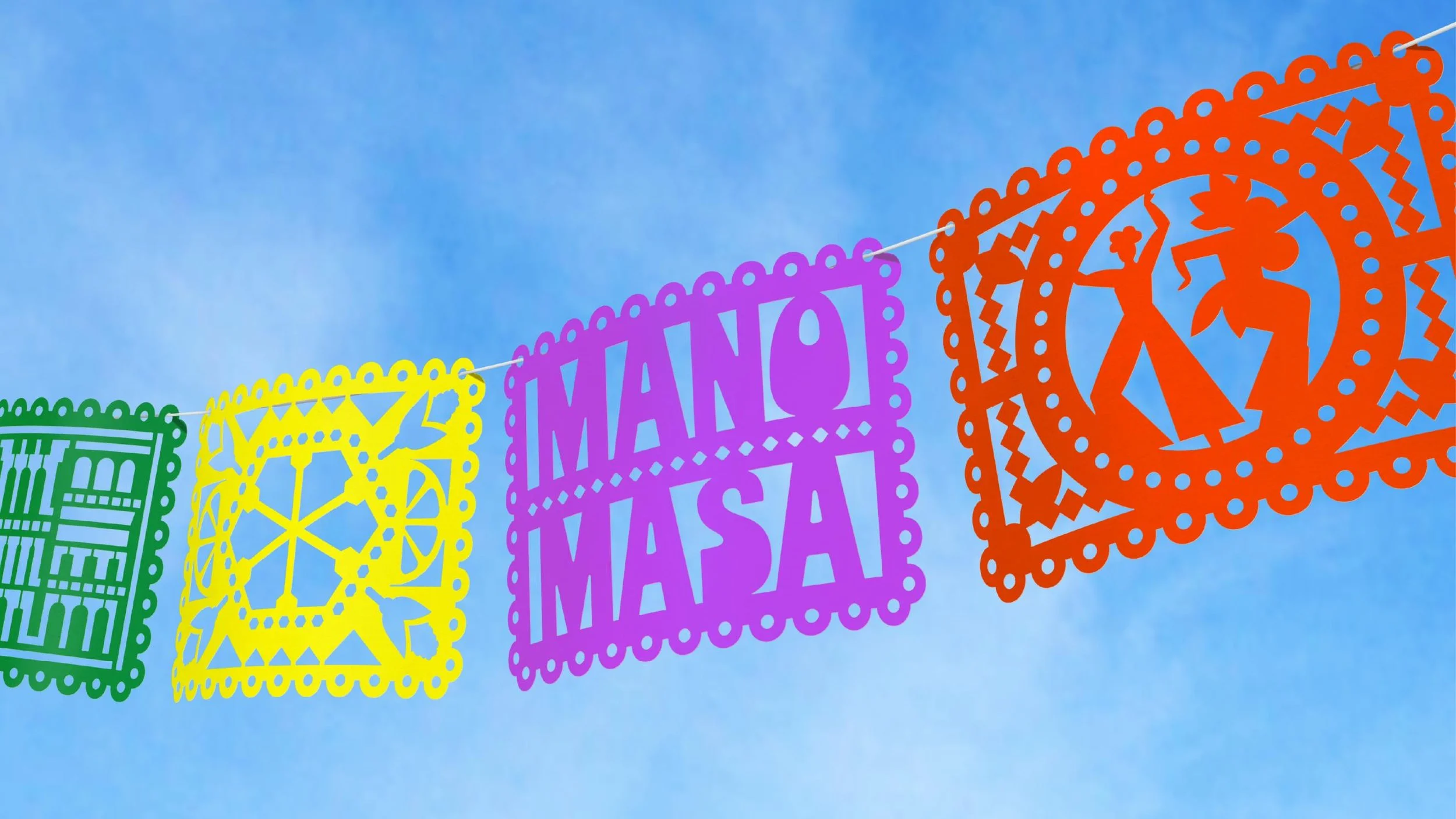
Our strategy was to go back to first principles, embracing the original inspiration for the product’s creation by bringing the visual experience of the brand in line with it’s flavour.
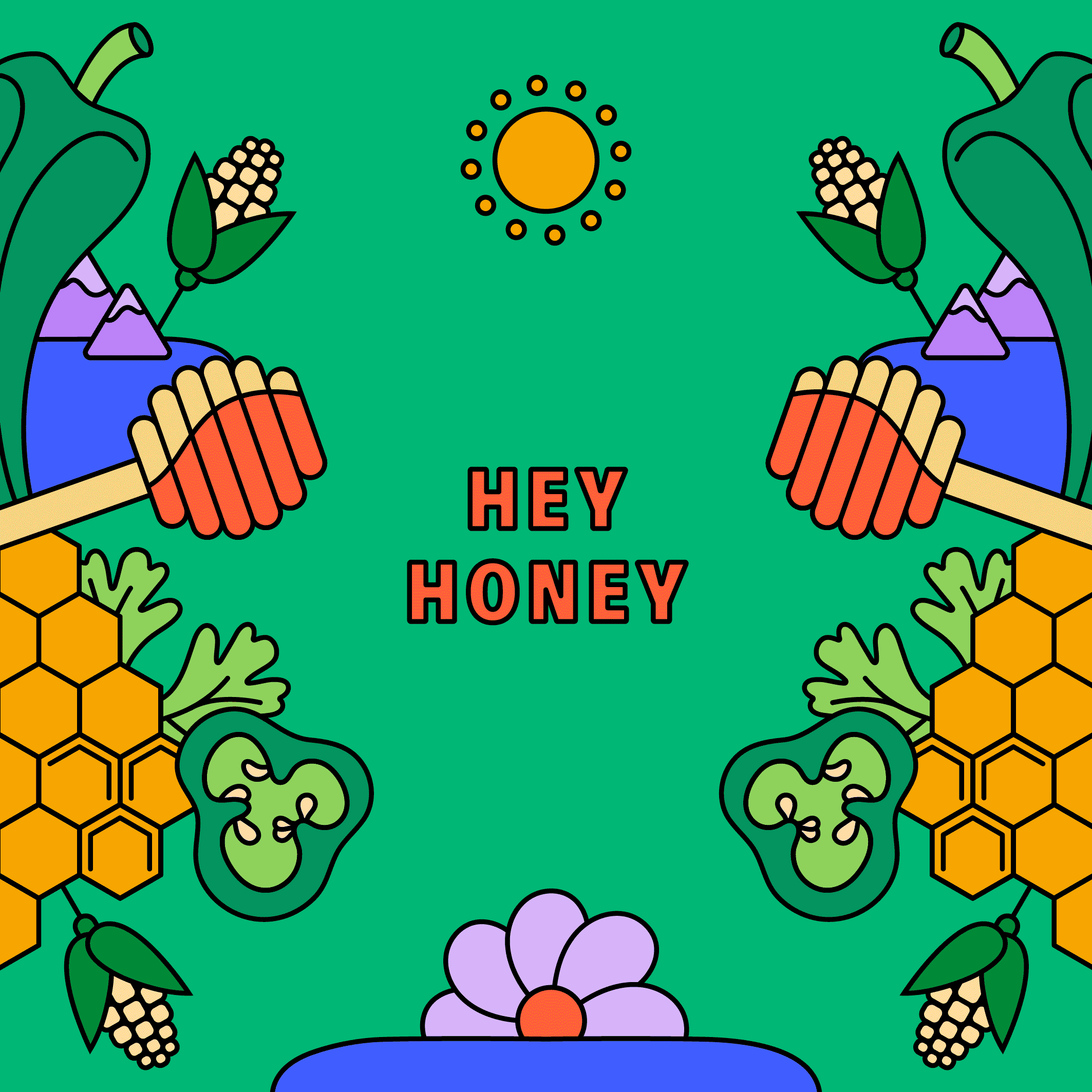
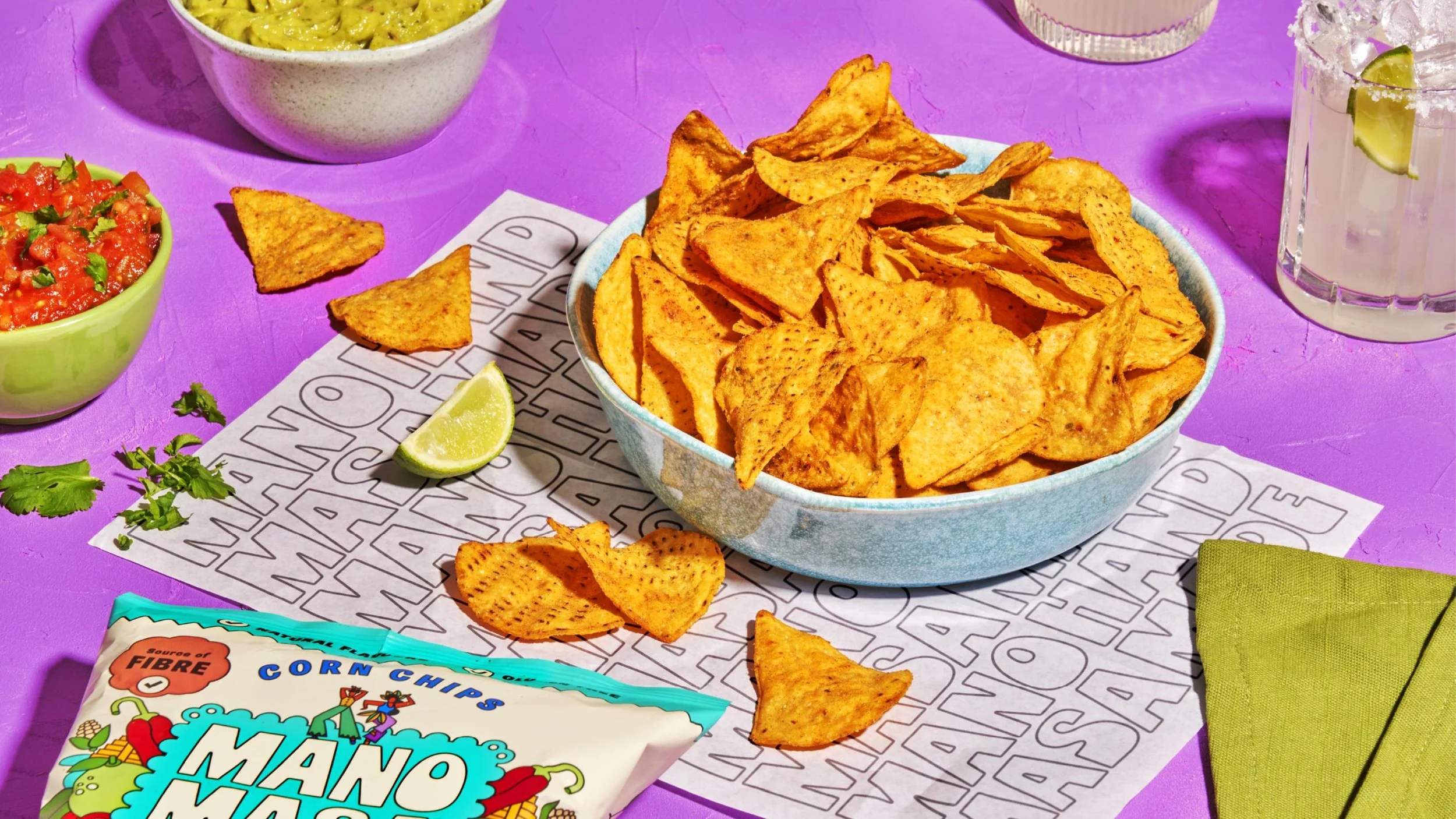
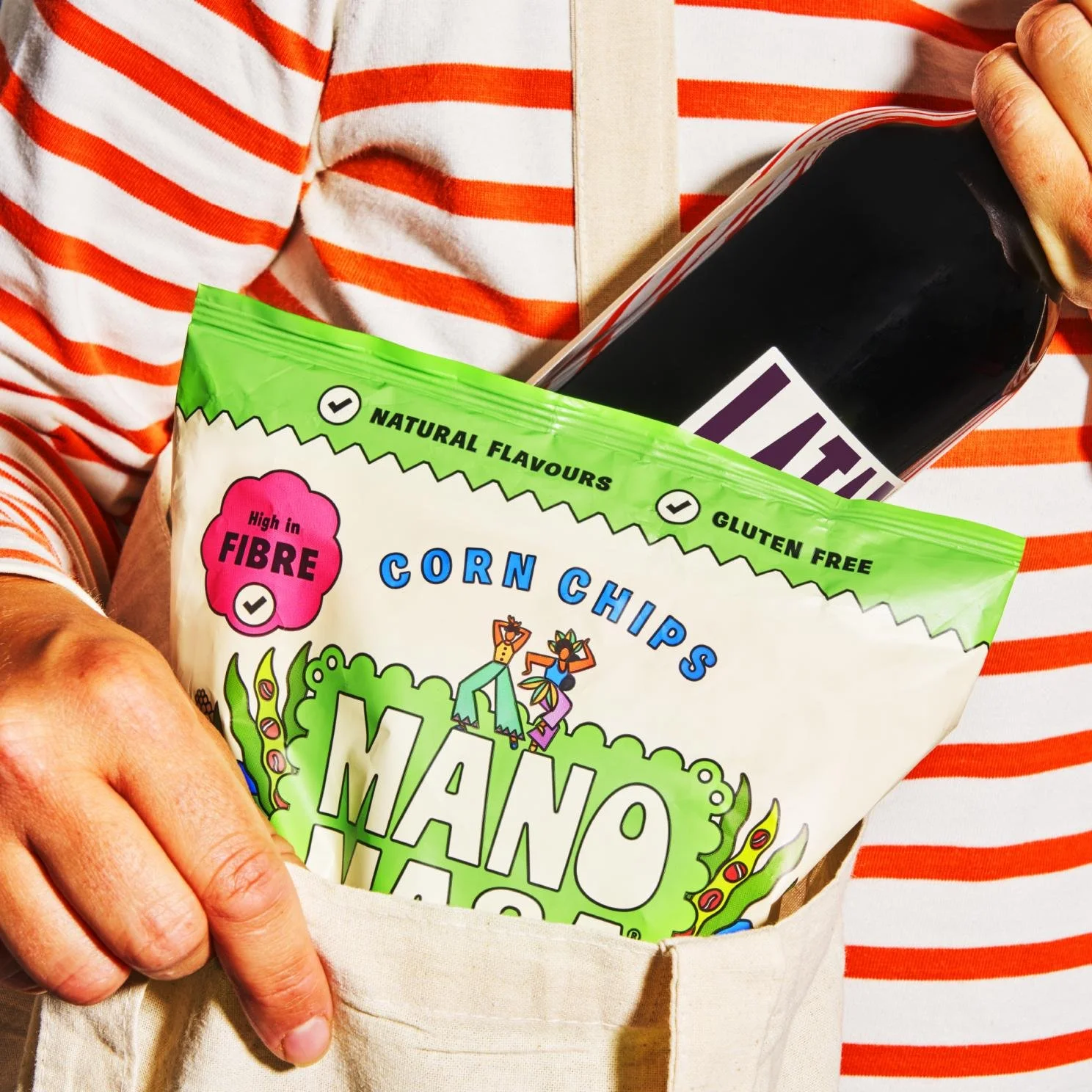
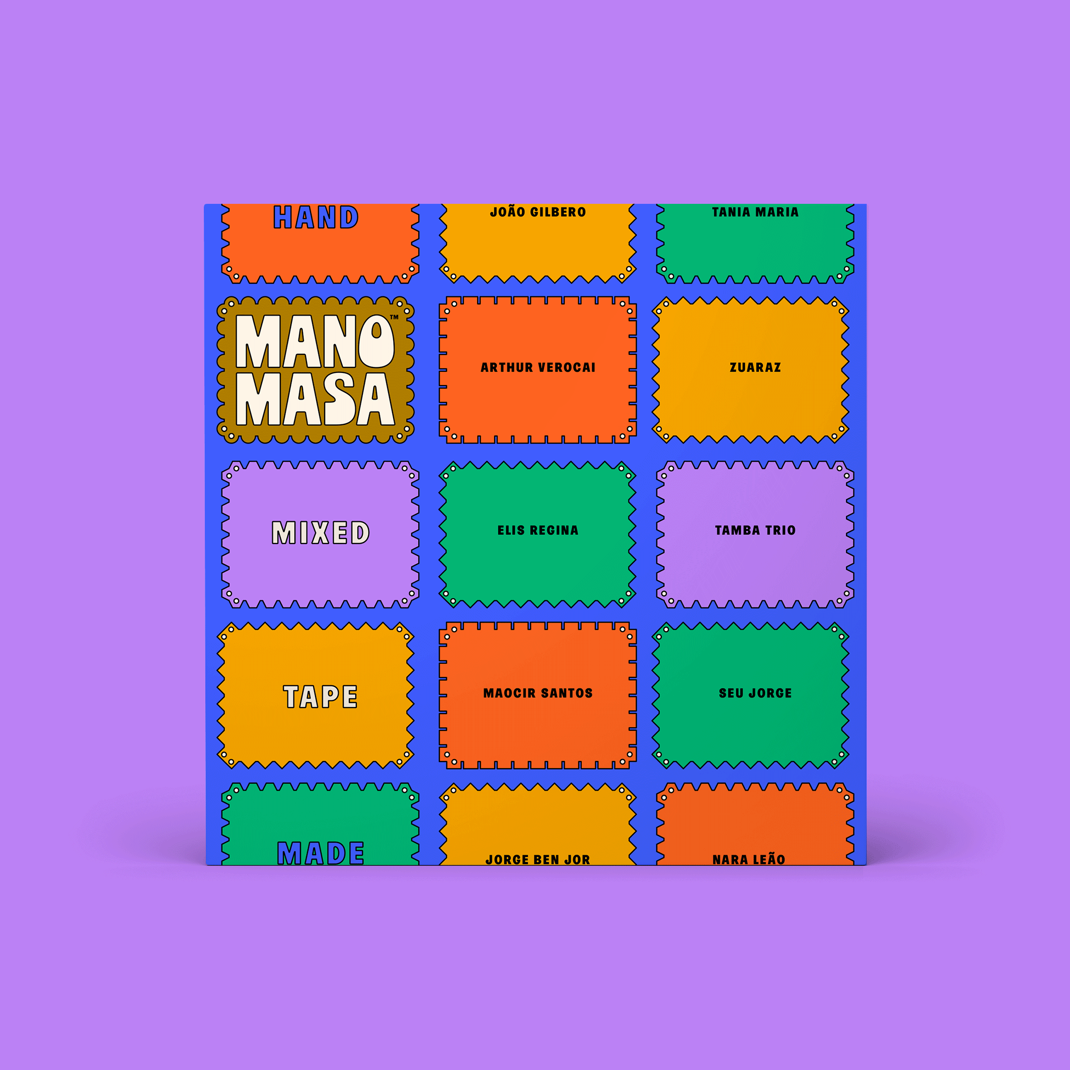
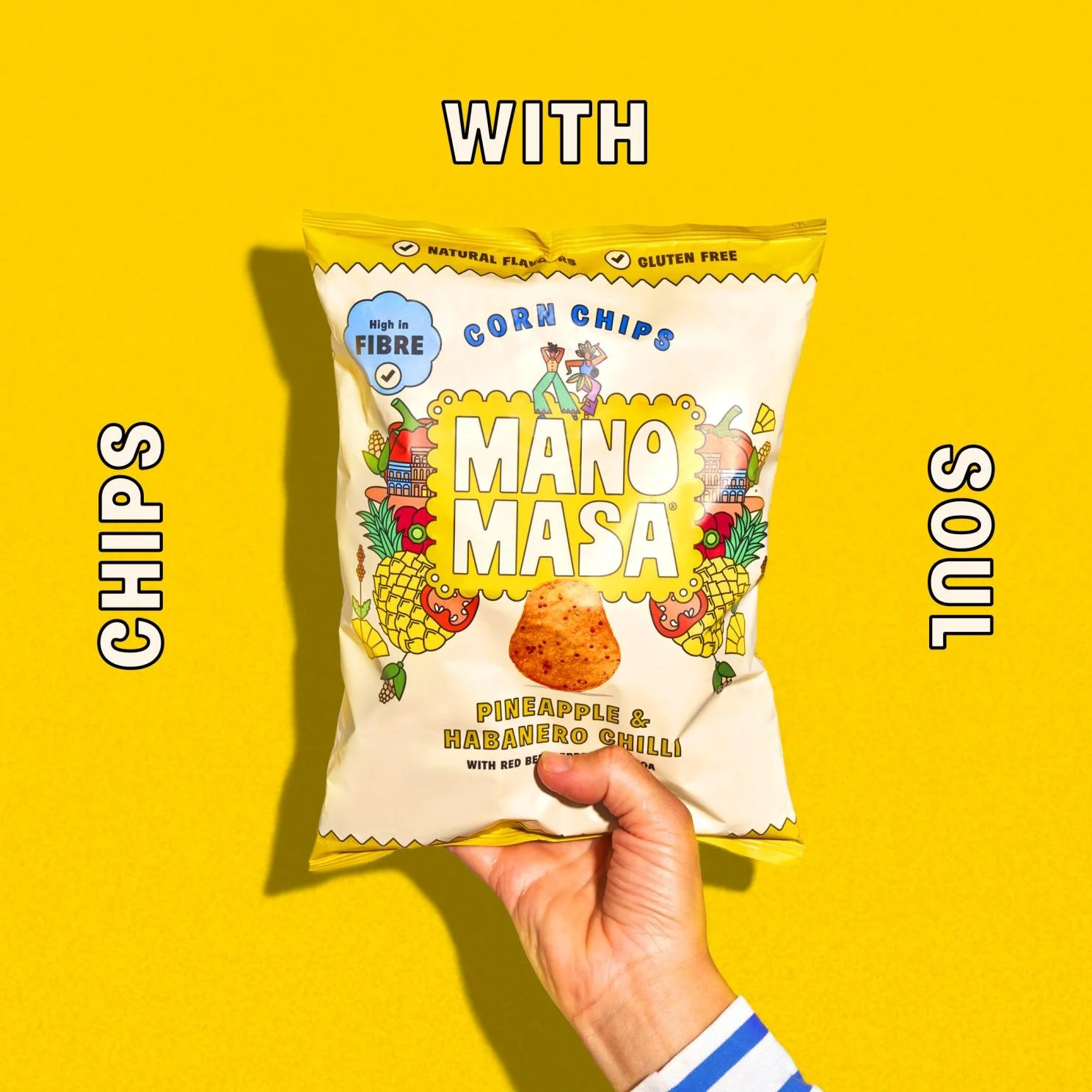
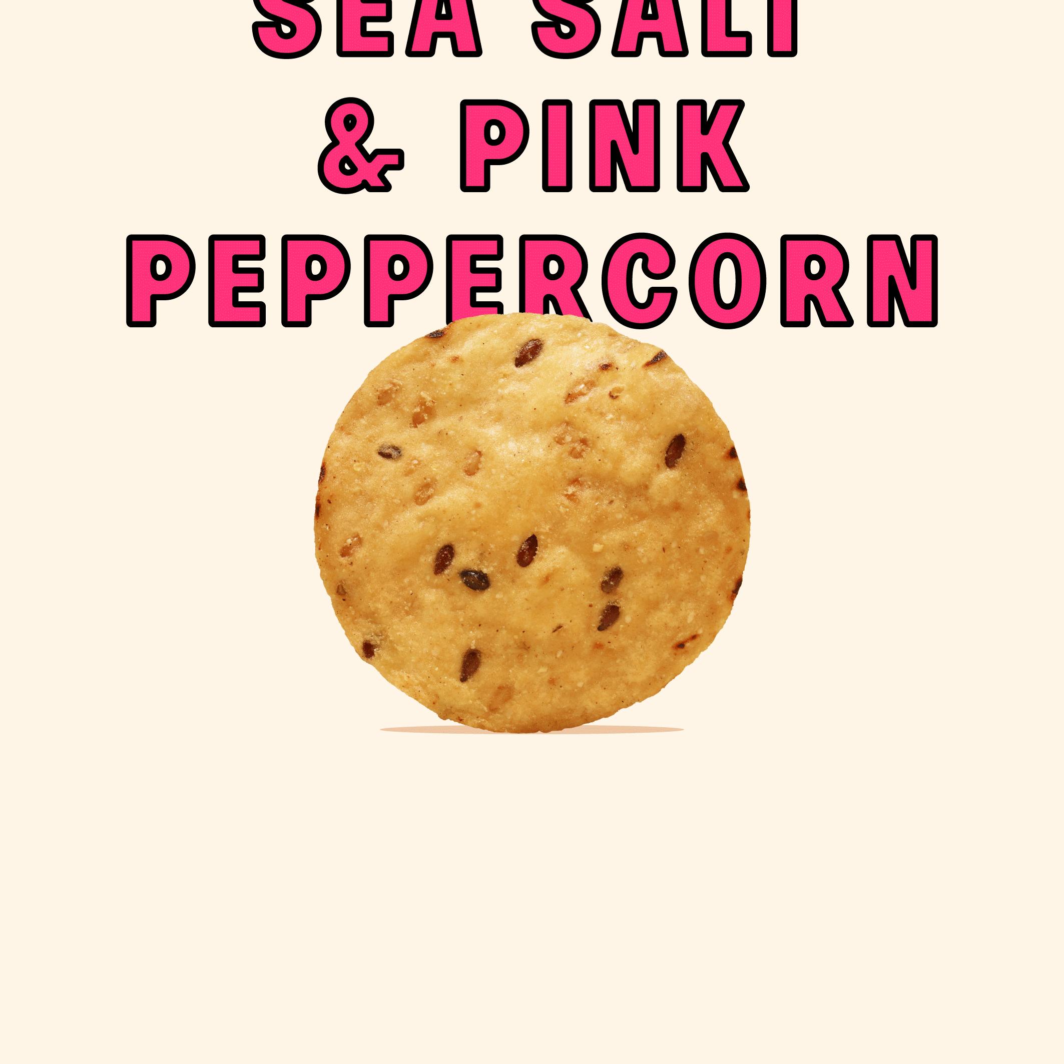
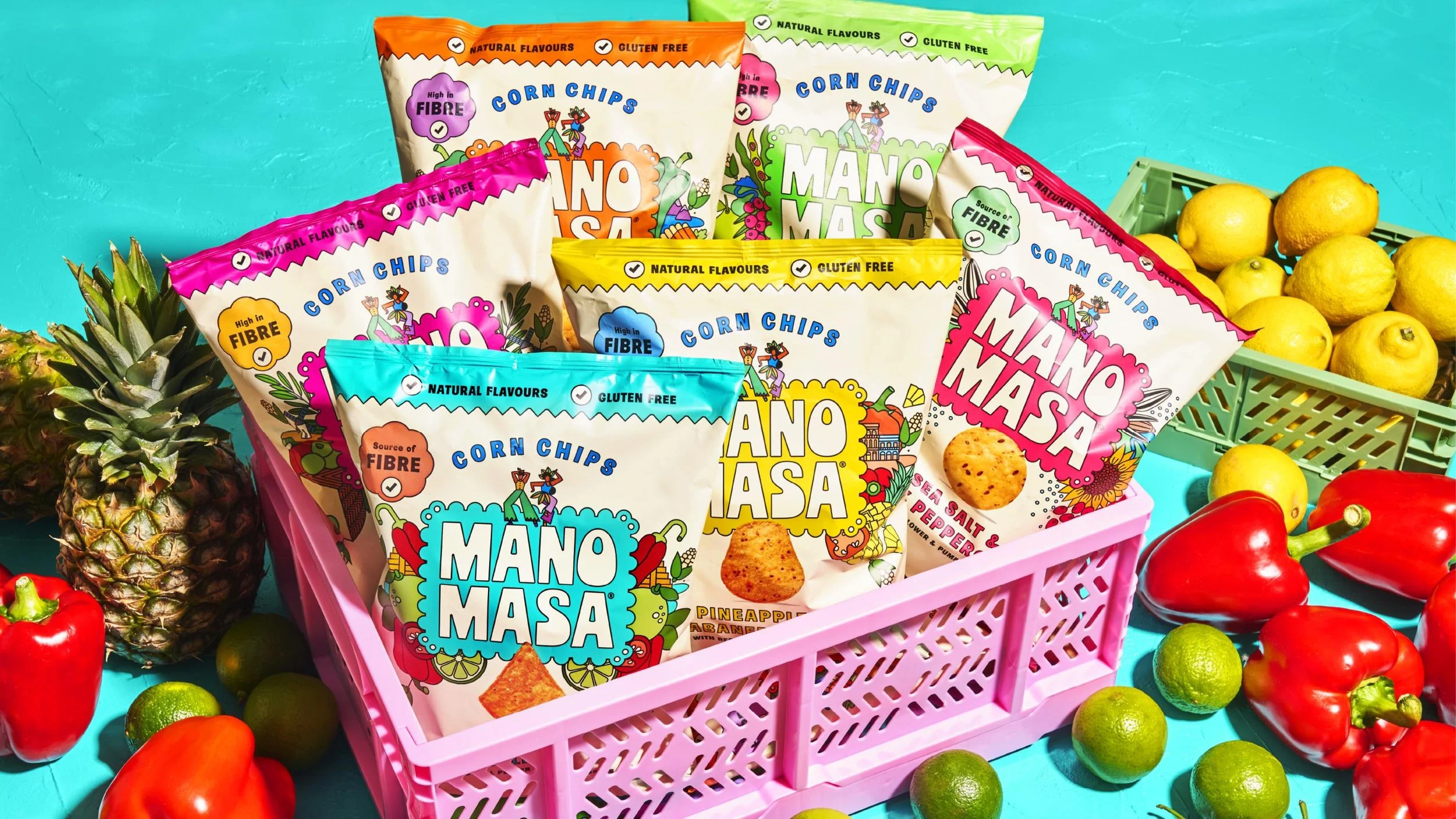
Latin America is an area of the world synonymous with energy, passion, colour and warmth. We took the existing visual structure of the packaging – central logotype, kaleidoscopic ingredient story and cream background – and spiced them all up with this distinctively idiosyncratic LatAm spirit.
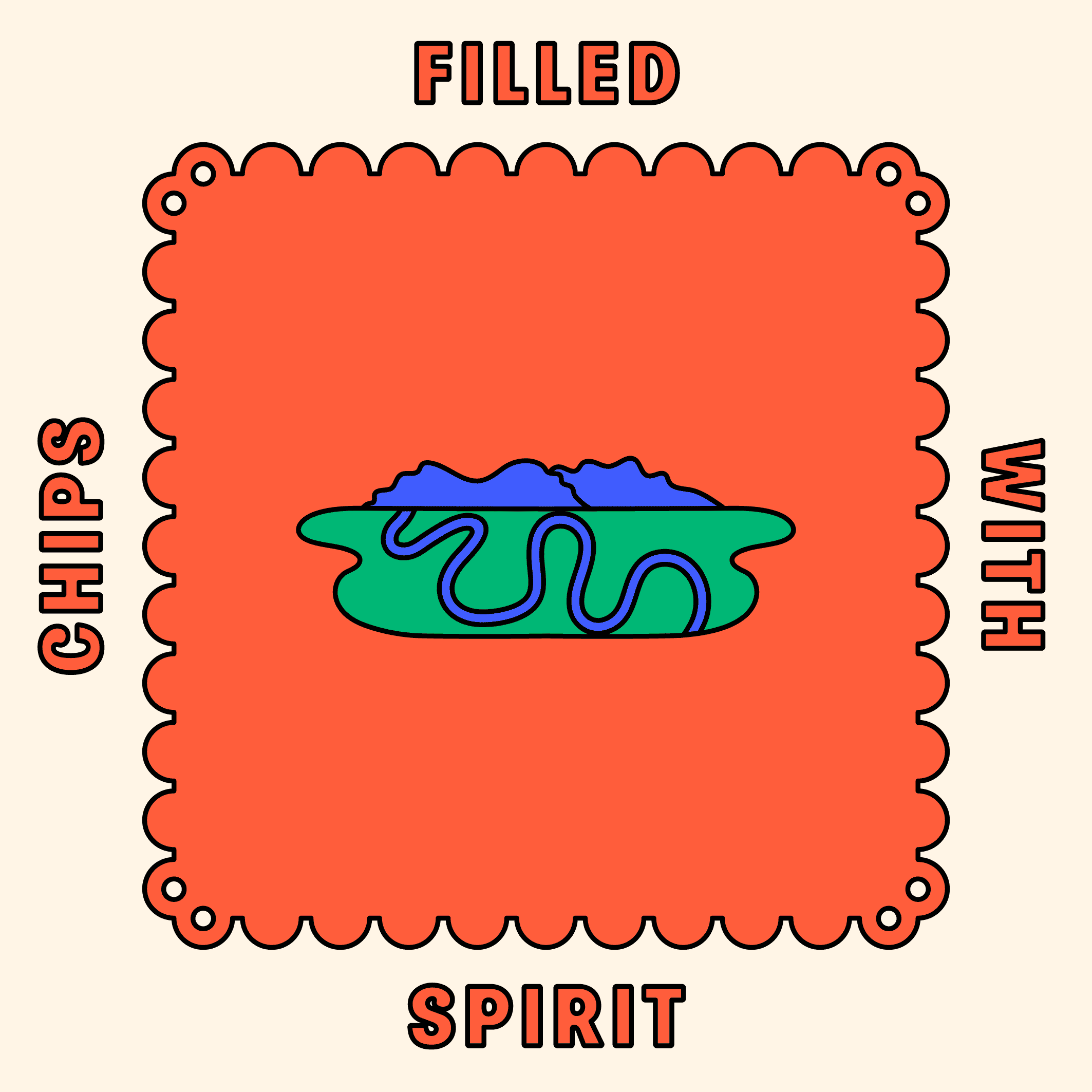
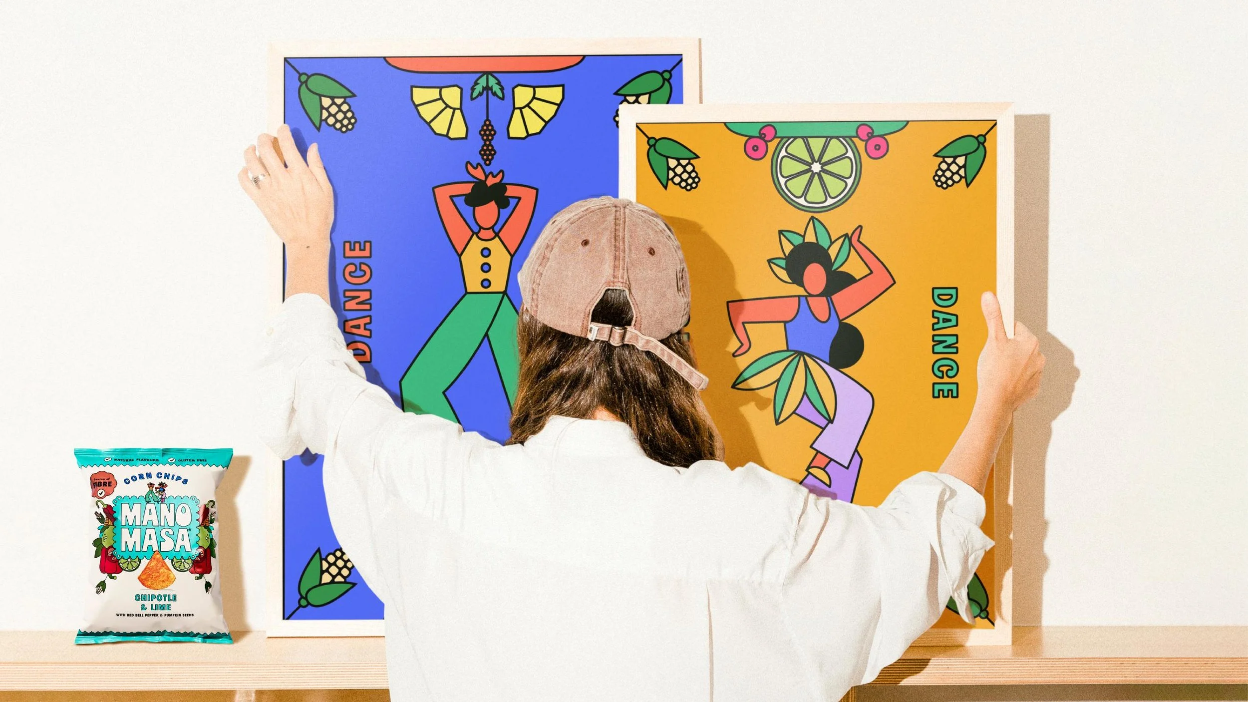
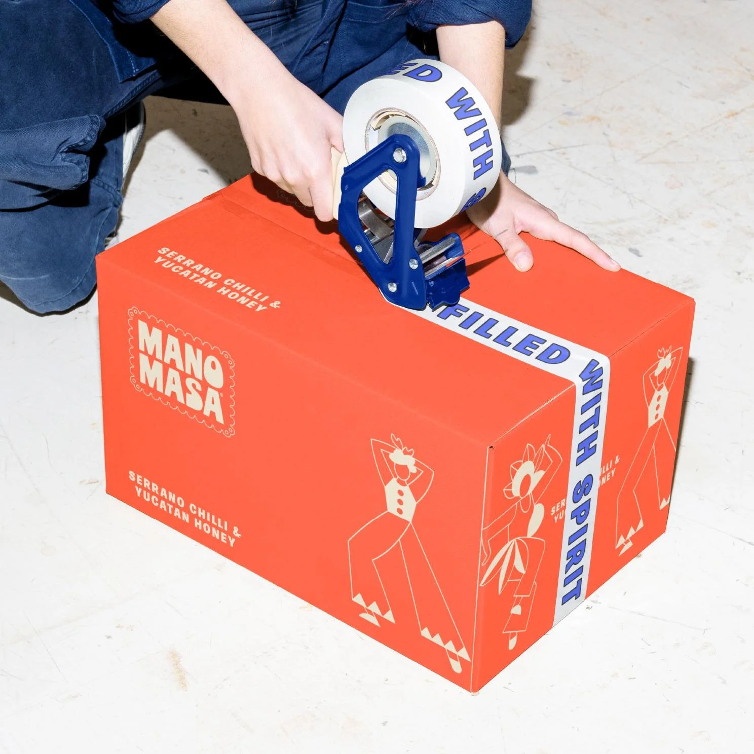
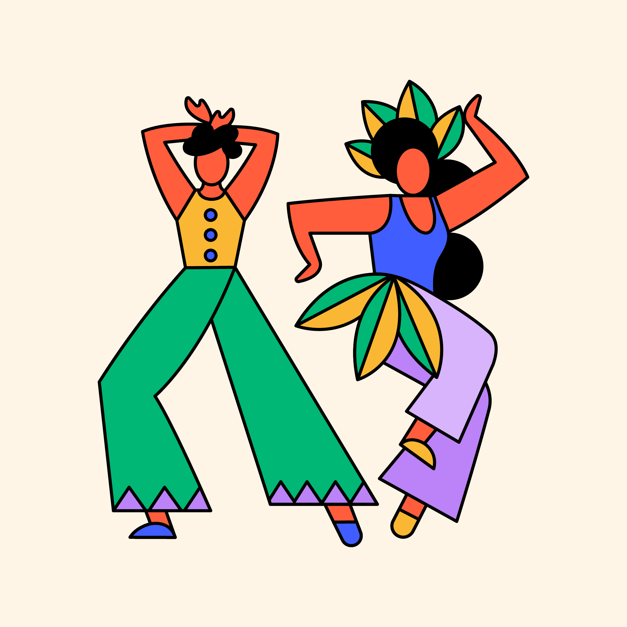
We also took the opportunity to pepper a new icon of a pair of dancers into the mix. In the midst of their joyful routine, they capture a sense of rhythm that opens up a world of potential in bringing the brand to life across platforms in vibrant motion.
Skillset
Creative Strategy
Identity
Brand Design
Packaging Design
Illustration
Livin’ la vida LatAm
-
The Manomasa name was created from a Latin American route: ‘Mano’ is Spanish for hand and ‘Masa’ is the maize dough that’s used to make traditional tortilla chips.
Since its launch, the brand has built up a small but dedicated following, who delight in the delicious flavours and exciting textures found across the range.
But despite this fanbase, the brand was struggling to make headway beyond its position as one of many wholesome ’farm shop-esque’ snack brands found in premium retailers.
How can design be used to break a brand out of a niche and into the mainstream?
-
Our strategy was to go back to first principles, embracing the original inspiration for the product’s creation by bringing the visual experience of the brand in line with it’s flavour.
Latin America is an area of the world synonymous with energy, passion, colour and warmth. We took the existing visual structure of the packaging – central logotype, kaleidoscopic ingredient story and cream background – and spiced them all up with this distinctively idiosyncratic LatAm spirit.
We also took the opportunity to pepper a new icon of a pair of dancers into the mix. In the midst of their joyful routine, they capture a sense of rhythm that opens up a world of potential in bringing the brand to life across platforms in vibrant motion.
-
Creative Strategy
Identity
Brand Design
Packaging Design
Illustration


Recognition
Partners
Client: Valeo Foods
Strategy: Silas Amos
Artwork: The London Artworking Co.
Related projects