Dress to impress
Challenge
The Olive Oil category in the UK is rich and storied, with brands old and new playing to themes of rustic tradition, health and escapism.
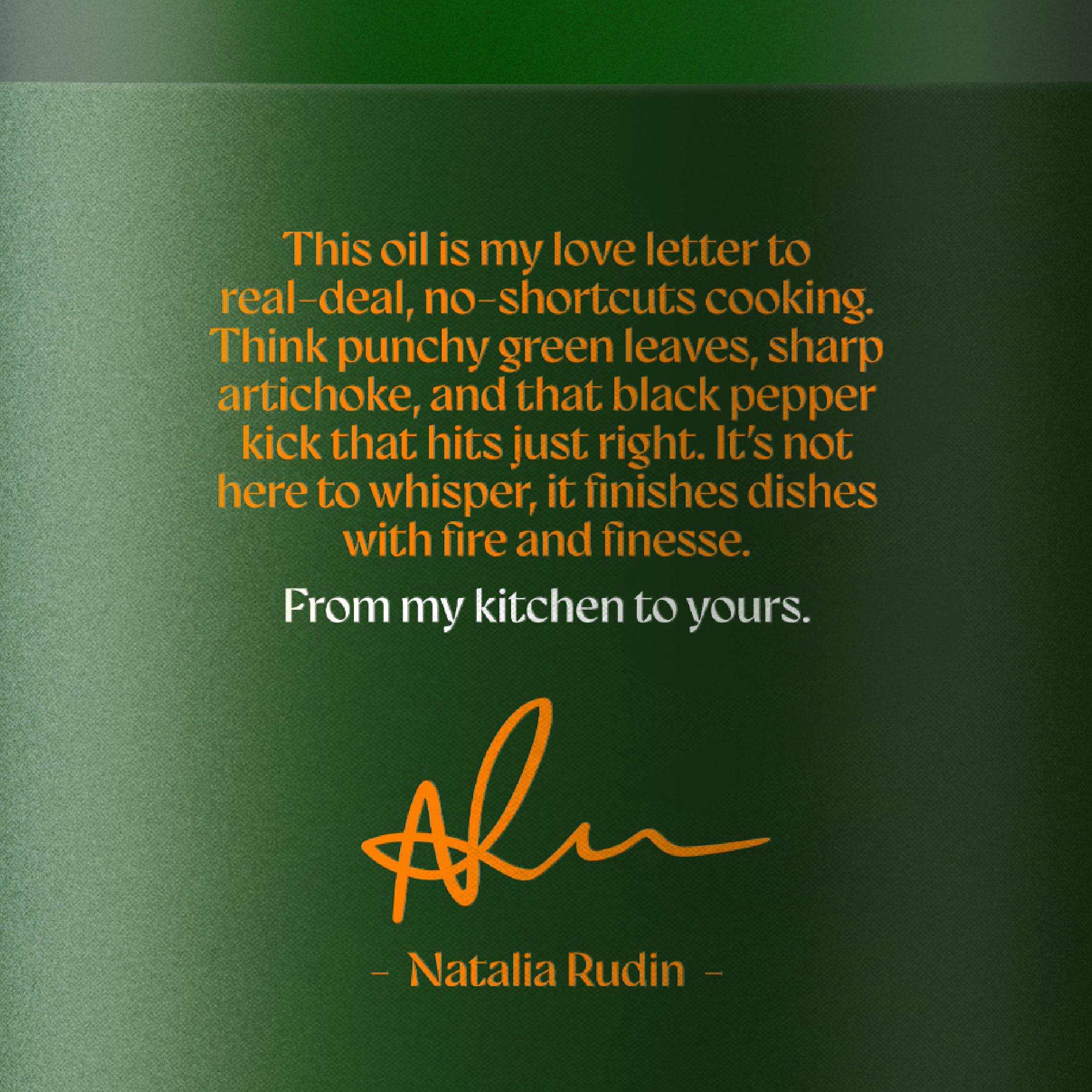
Natalia Rudin, best selling author & recipe developer is at the forefront of a growing culture of home chefs that are looking for something different.
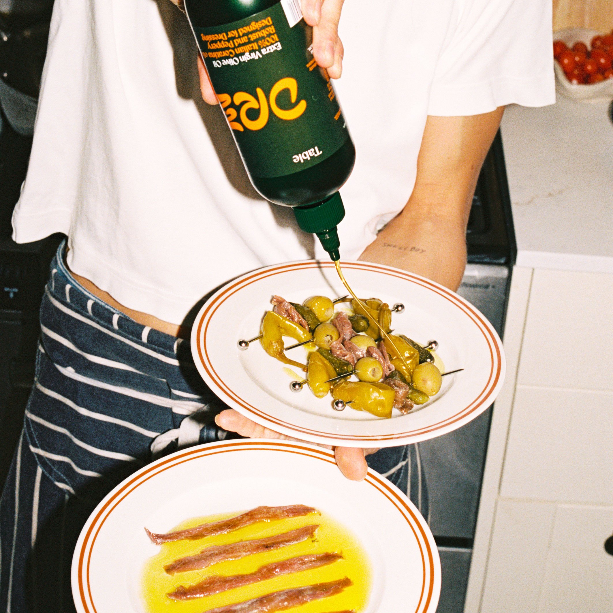
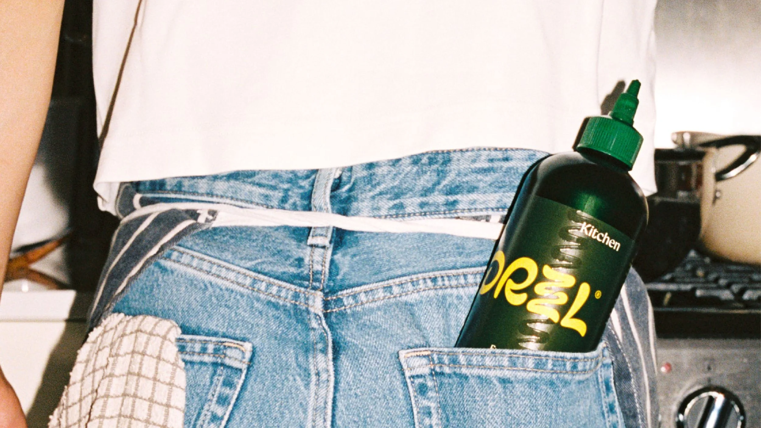
They’re chasing premium pantry brands that look as good as they taste. Design that exudes a confident sense of cool; feeling at home on a dinner party table as well as the kitchen.
How can design bring the kitchen to the table?
Solution
The Italian Coratina olive is wild, intense, and full of attitude. Not your average olive, and definitely not for average cooking.
We wanted to capture this potential for excitement and fiery flavour, finessed by the artistry of a chef.
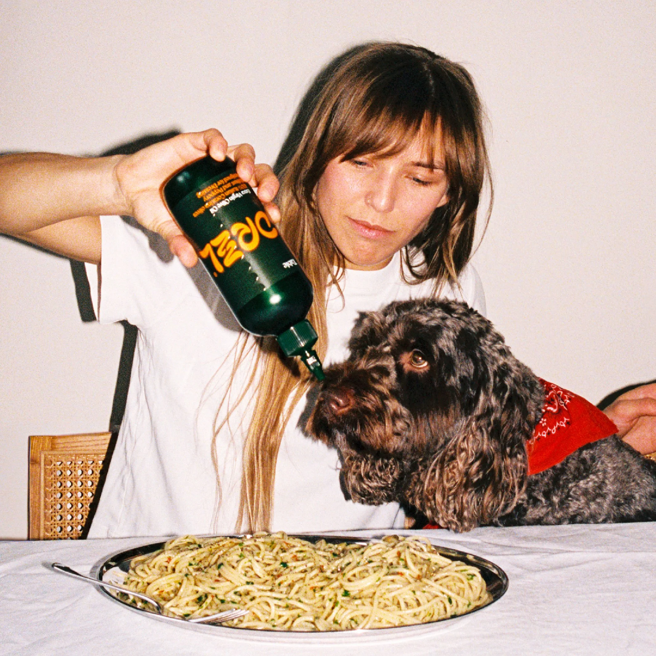
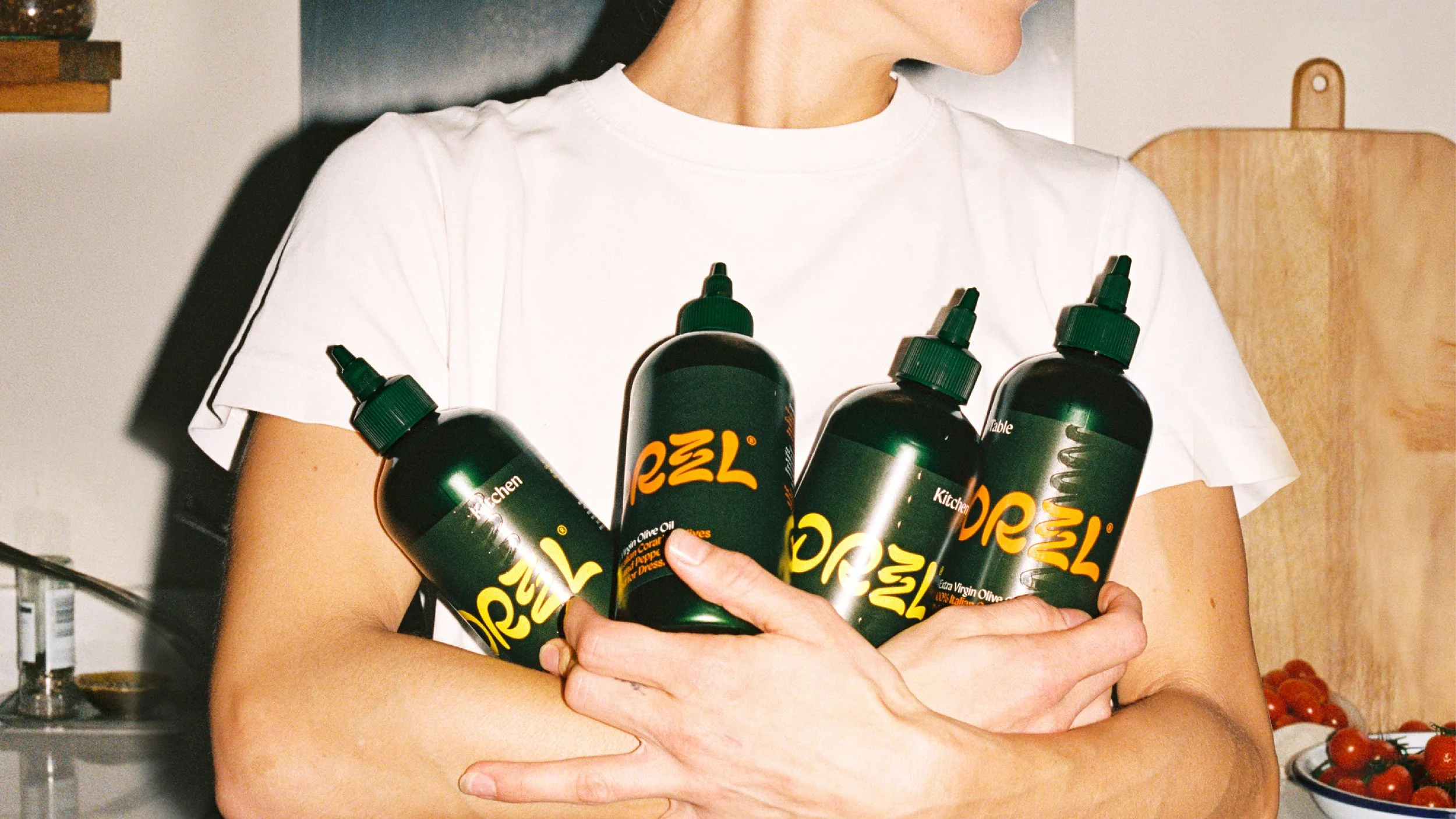
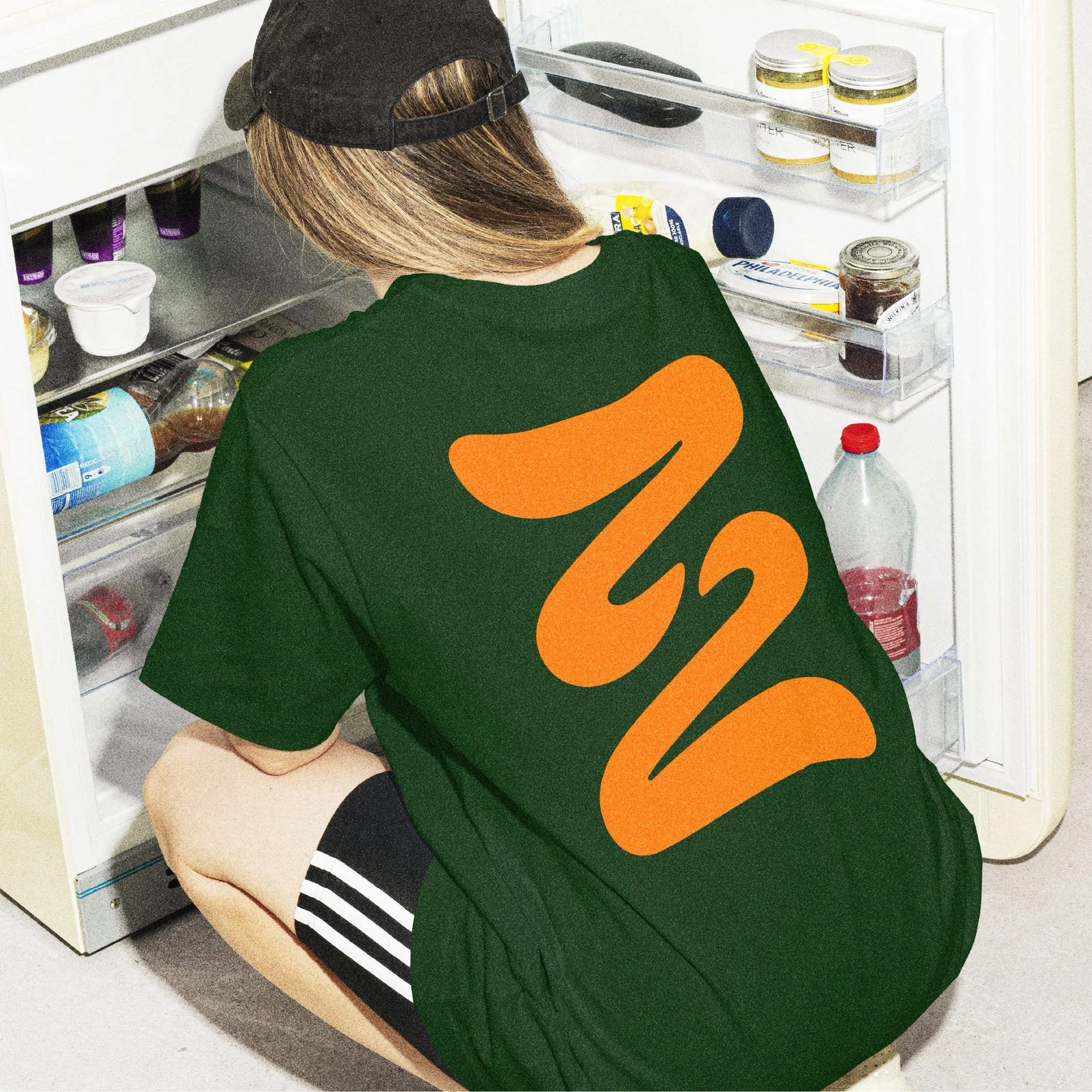
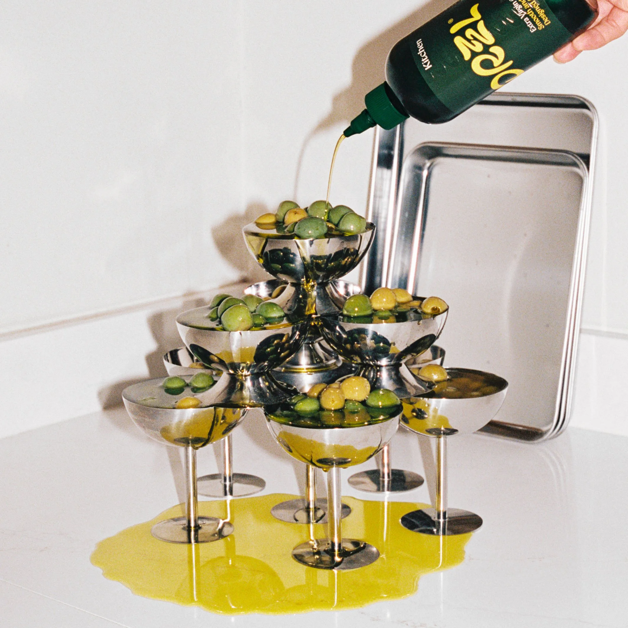
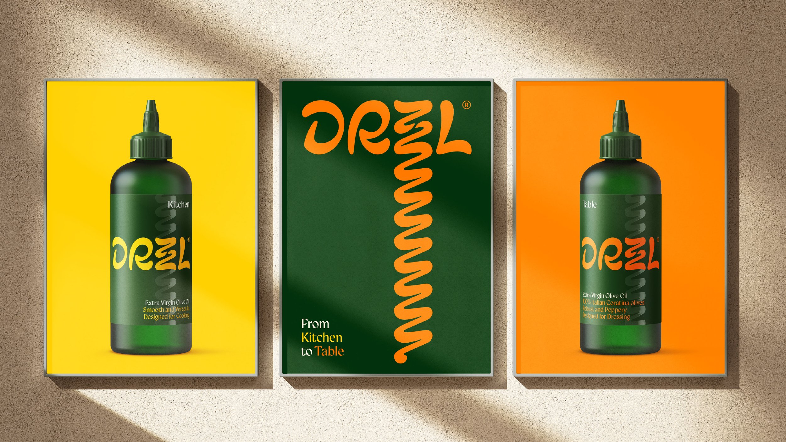
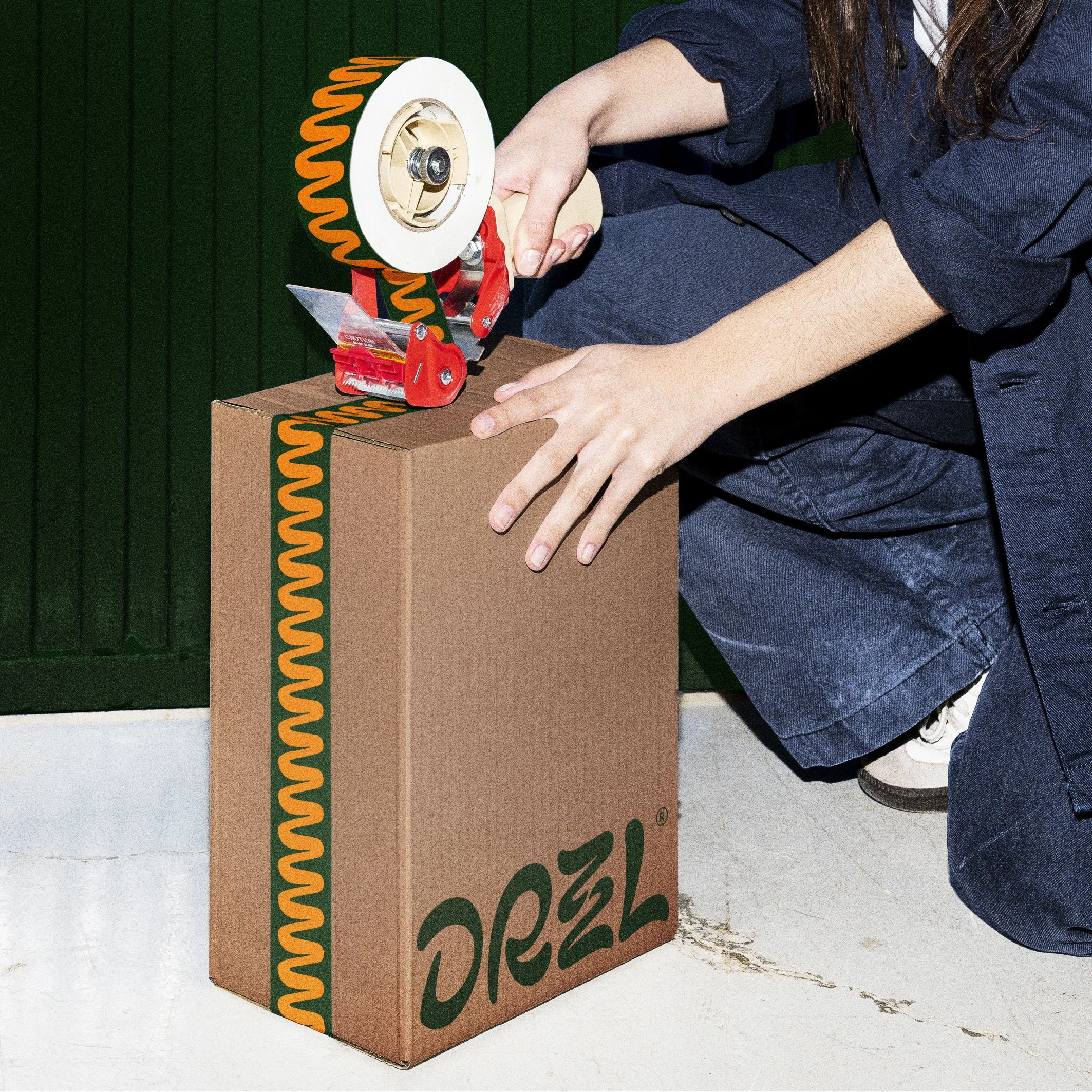
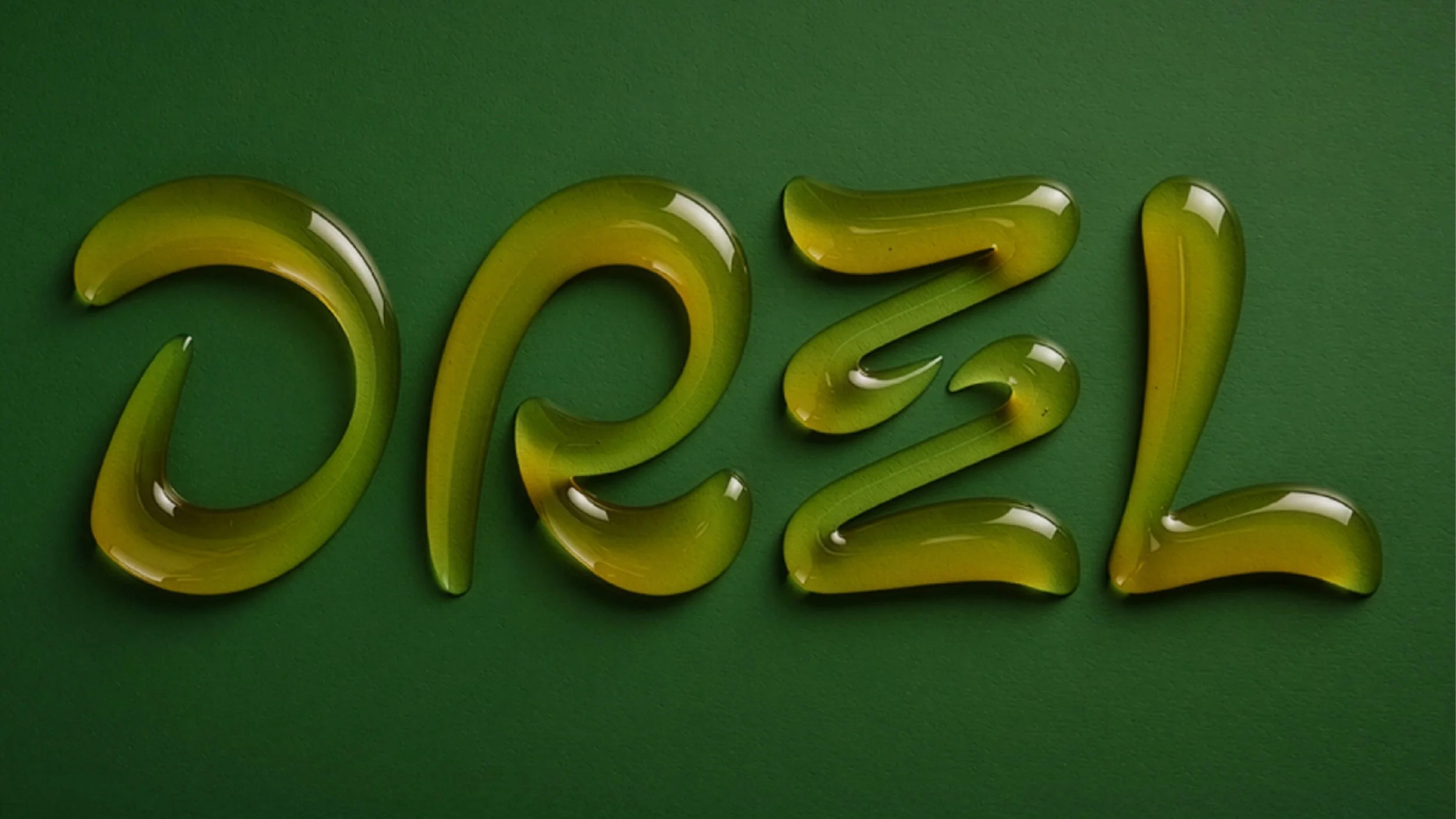
The Drzzl wordmark was created from stylised organic letterforms. The stacked ‘zz’ expanding out to evoke the expansive pour of fine olive oil, whether into a sizzling pan or onto a punchy salad.
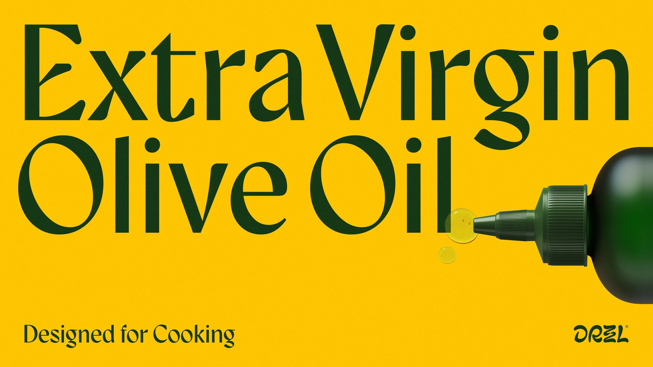
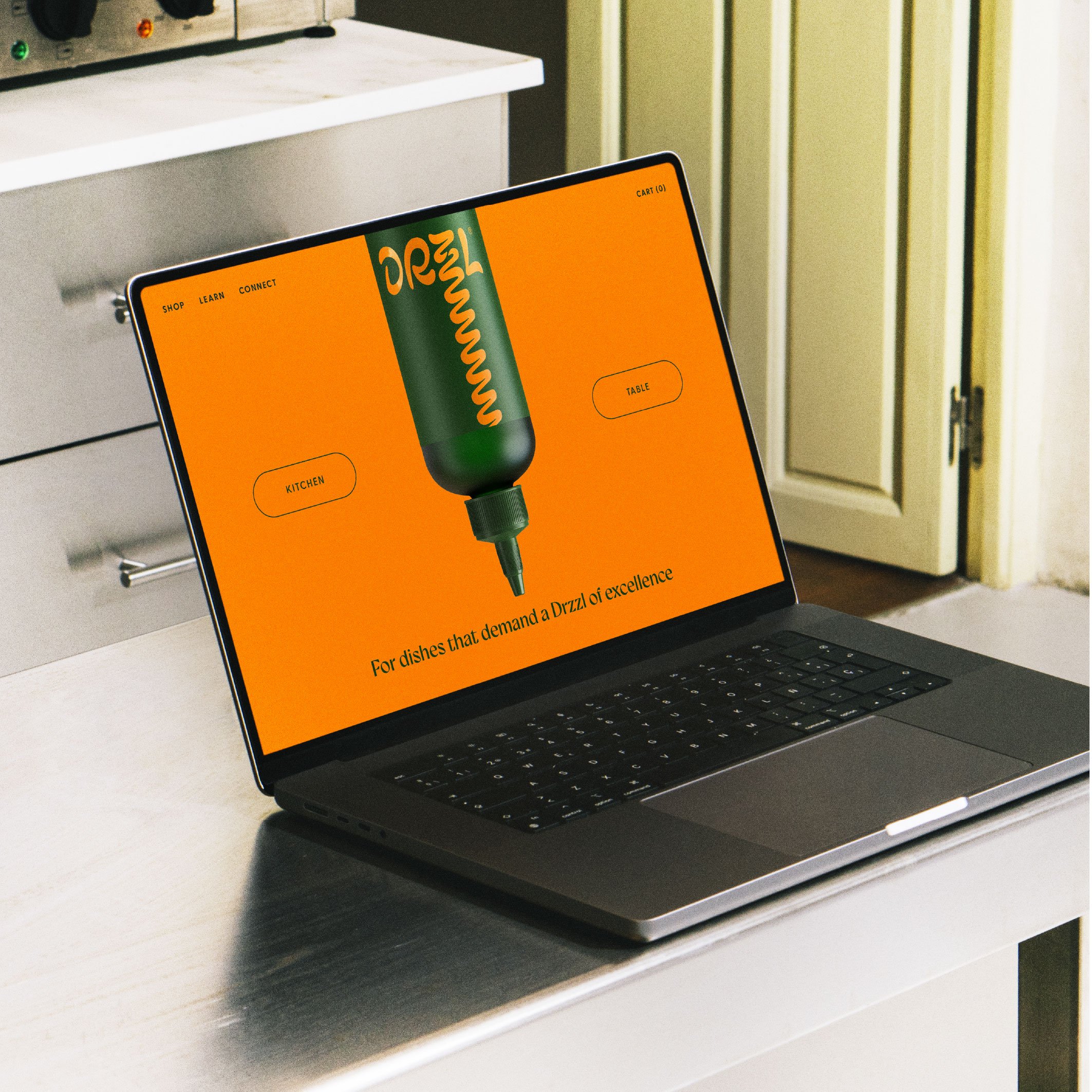
A clash of vibrant citrus colours with deep, leafy green hues delivers a sharp zing, classical typography speaking to an authentically mediterranean origin.
Dressed to impress.
Skillset
Strategy
Identity
Brand Design
Packaging
Dress to impress
-
The Olive Oil category in the UK is rich and storied, with brands old and new playing to themes of rustic tradition, health and escapism.
Natalia Rudin, best selling author & recipe developer is at the forefront of a growing culture of home chefs that are looking for something different.
They’re chasing premium pantry brands that look as good as they taste. Design that exudes a confident sense of cool; feeling at home on a dinner party table as well as the kitchen.
How can design bring the kitchen to the table?
-
The Italian Coratina olive is wild, intense, and full of attitude. Not your average olive, and definitely not for average cooking.
We wanted to capture this potential for excitement and fiery flavour, finessed by the artistry of a chef.
The Drzzl wordmark was created from stylised organic letterforms. The stacked ‘zz’ expanding out to evoke the expansive pour of fine olive oil, whether into a sizzling pan or onto a punchy salad.
A clash of vibrant citrus colours with deep, leafy green hues delivers a sharp zing, classical typography speaking to an authentically mediterranean origin.
Dressed to impress.
-
Strategy
Identity
Brand Design
Packaging
“D&E perfectly captured the tone of voice and identity of our brand through design and have created something people genuinely connect with. They totally brought our brand to life, challenged us in all the right ways and created an identity that feels distinctive, premium and unmistakably DRZZL.
They were thoughtful, collaborative and a real extension of our team throughout. I couldn't recommend them more highly.”
Natalia Rudin
Founder, Drzzl

Recognition
Partners
Wordmark - Studio Drama
Visualisation - Christian Myers
Related projects