Elegance with attitude
Challenge
The provenance of a brand can be an opportunity to drive personality, from French fashion houses to Italian car makers, Californian tech giants to Swiss chocolatiers.
It’s no surprise then, that in the world of gin, many brands whose products are created in the ‘London Dry’ style link themselves to the city through design and storytelling.
Dulwich Gin, named for a leafy suburb south of the river, takes that focus one step further, delivering a single intriguing slice of the metropolis.
How do you design a brand to amplify hyper local credentials?
Solution
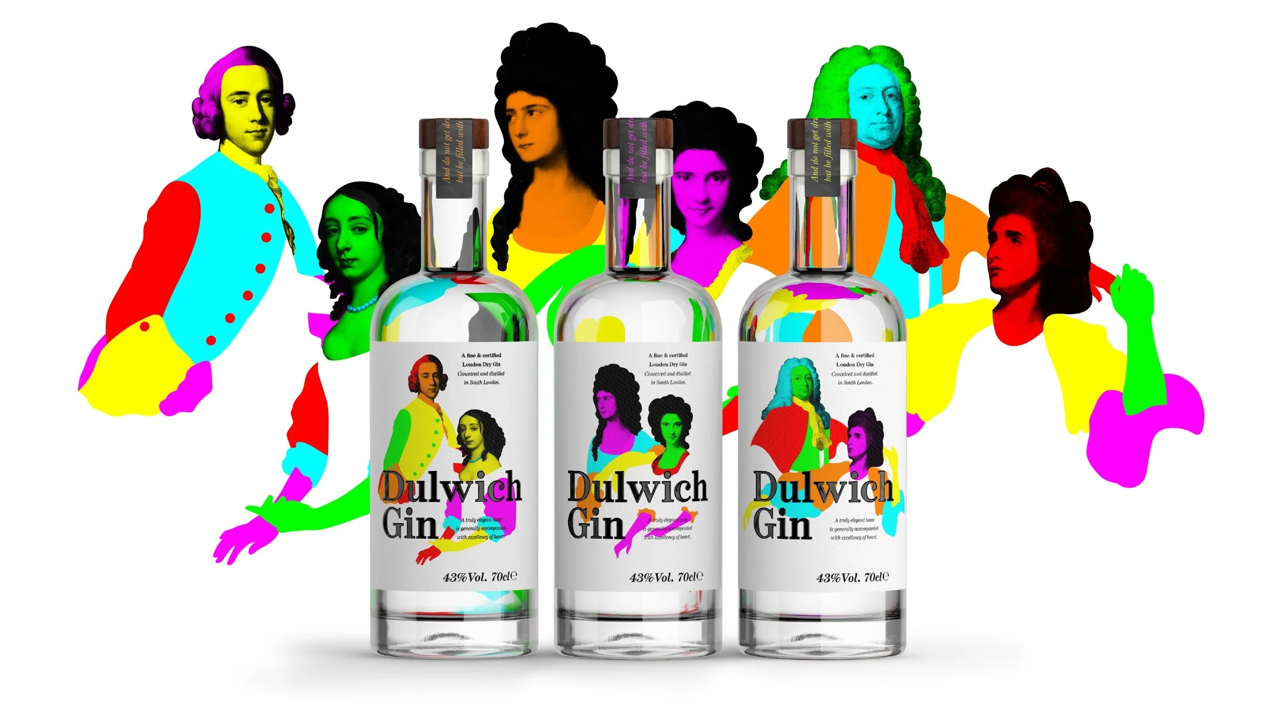
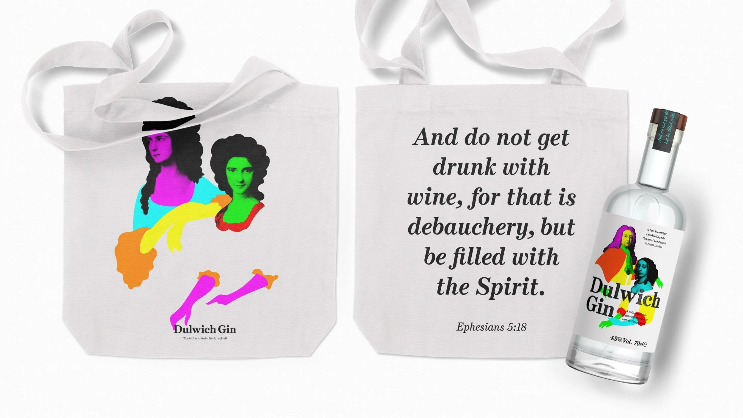
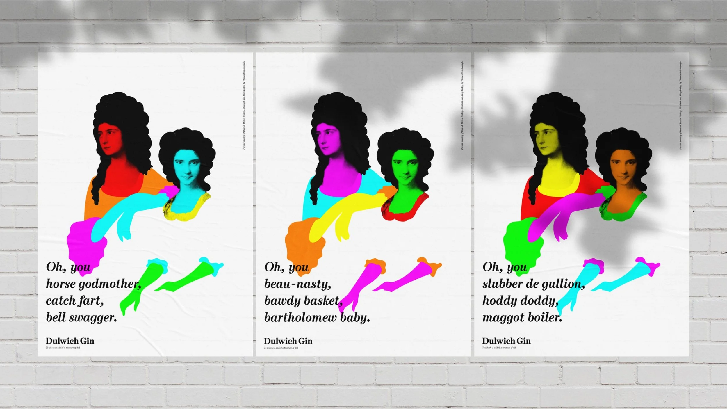
Dulwich is home to the Dulwich Picture Gallery, opened in 1811, an era when seemingly all London was downing gin. It was the drink of the decadent and dissolute, from street corners to stately homes.
Taking inspiration from these (in)famous times, we aimed to capture the elegance and style of the era in a modern way, both classic and playful.
By leveraging cutting edge HP printing technologies, we were able to ensure that no two bottles of Dulwich Gin are ever the same, each remixing Georgian portraits from the gallery in endlessly unique combinations of characters and colours.
Skillset
Strategy
Identity
Brand Design
Packaging
Elegance with attitude
-
The provenance of a brand can be an opportunity to drive personality, from French fashion houses to Italian car makers, Californian tech giants to Swiss chocolatiers.
It’s no surprise then, that in the world of gin, many brands whose products are created in the ‘London Dry’ style link themselves to the city through design and storytelling.
Dulwich Gin, named for a leafy suburb south of the river, takes that focus one step further, delivering a single intriguing slice of the metropolis.
How do you design a brand to amplify hyper local credentials?
-
Dulwich is home to the Dulwich Picture Gallery, opened in 1811, an era when seemingly all London was downing gin. It was the drink of the decadent and dissolute, from street corners to stately homes.
Taking inspiration from these (in)famous times, we aimed to capture the elegance and style of the era in a modern way, both classic and playful.
By leveraging cutting edge HP printing technologies, we were able to ensure that no two bottles of Dulwich Gin are ever the same, each remixing Georgian portraits from the gallery in endlessly unique combinations of characters and colours.
-
Strategy
Identity
Brand Design
Packaging
“D&E captured the essence of Dulwich Gin brilliantly. They were great fun to work with, which helped get to something good. The beautiful design, without doubt, helps us stand out in a highly completive category and also got us shortlisted for a couple of design awards.”
Tracy De Groose
Co-Founder, Dulwich Gin

Recognition
Partners
Client: Dulwich Gin
Strategy: Silas Amos
Animation: Dan Kennington
Production: Lisa Stillman
Print: FE Burman
Related projects