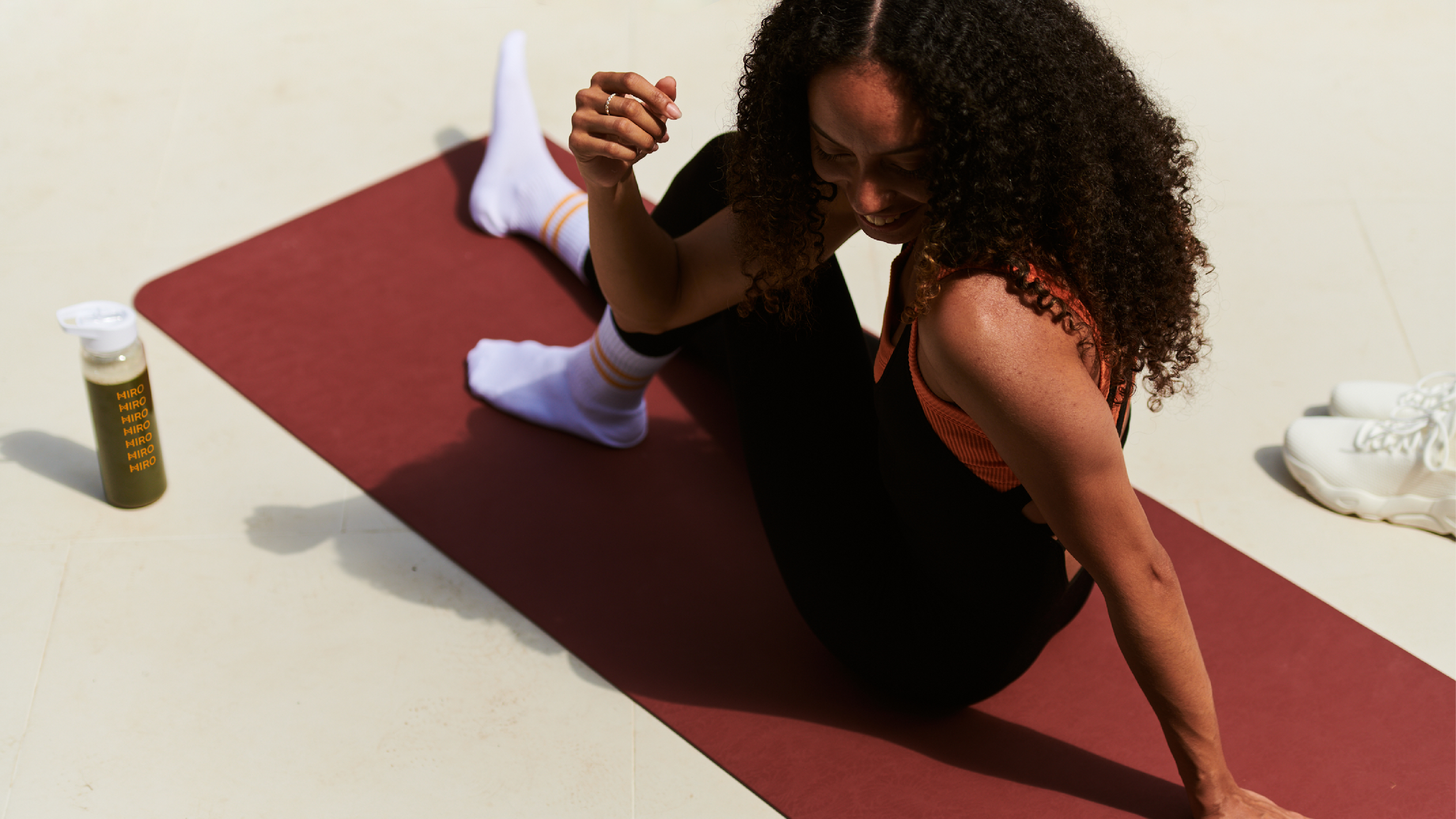
Feel okay, day by day
Challenge
In the early 2020s the UK CBD market was evolving rapidly, with innovative products hitting web stores and supermarket shelves with increasing frequency.
Working with strategic partner BigSmall, Cannaray sought to position itself as the first mass CBD brand, endeavouring to define the category as it entered the mainstream.
How can you use design to help fulfil bold ambitions in a nascent category?
Solution
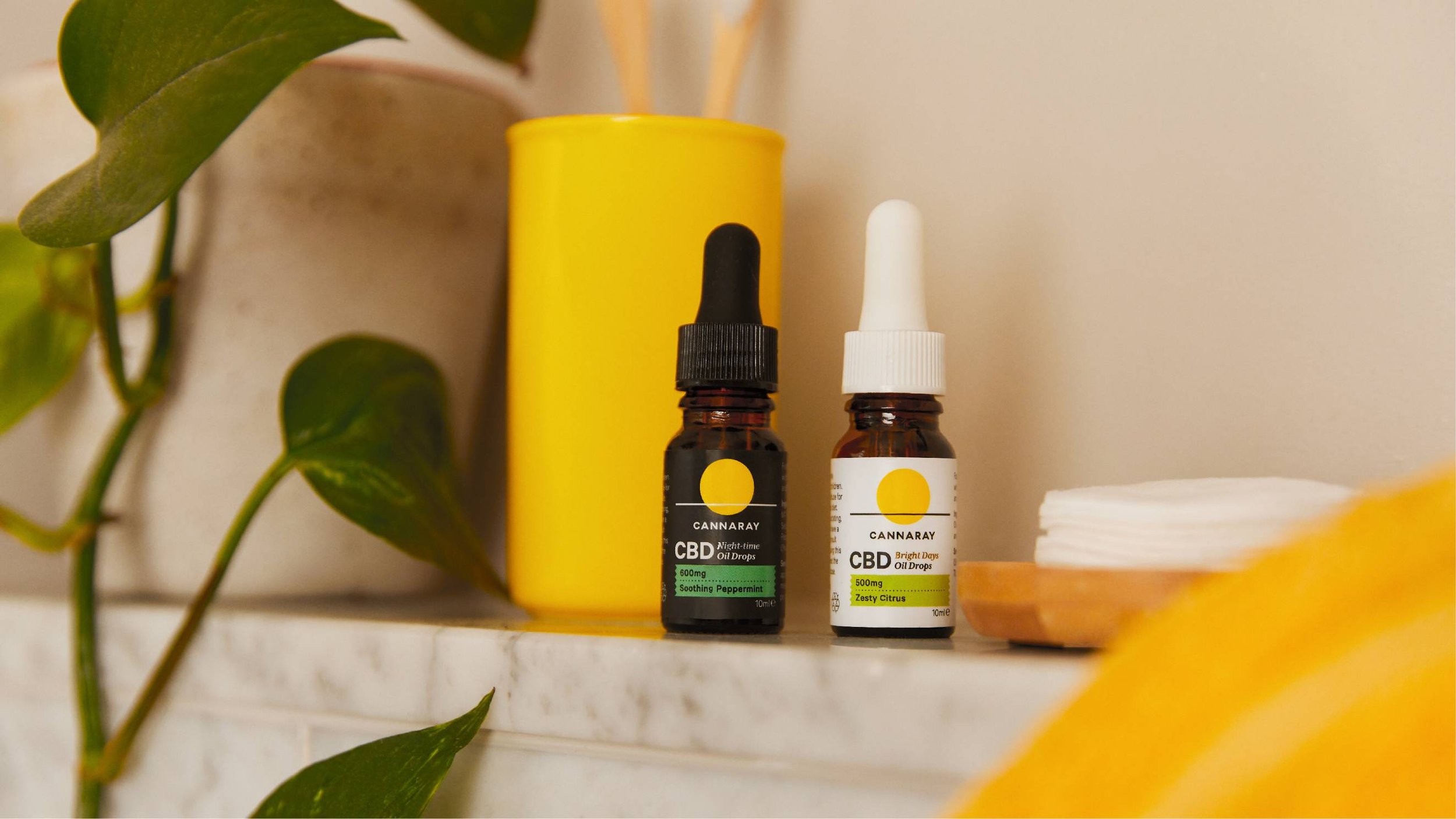
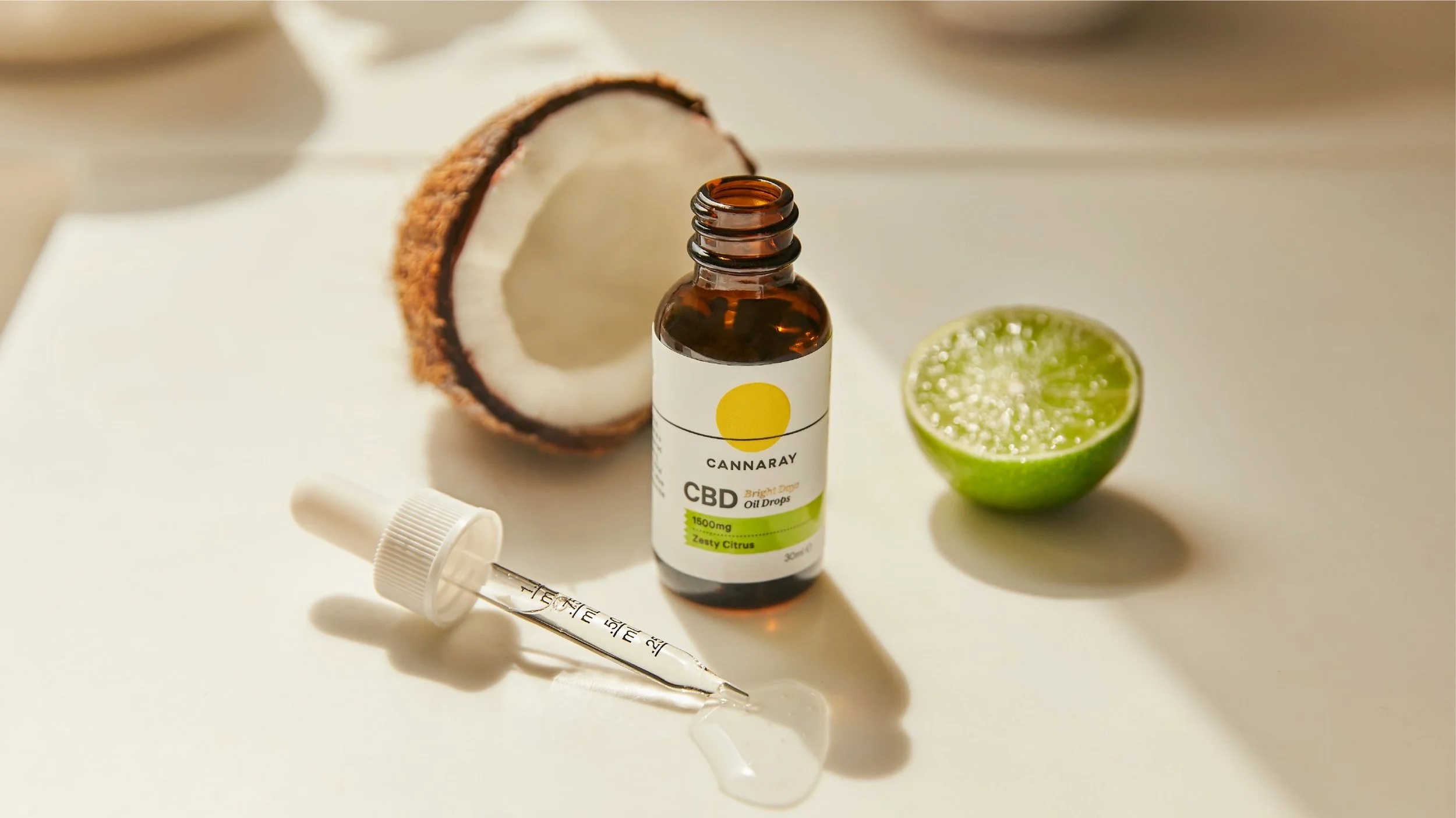
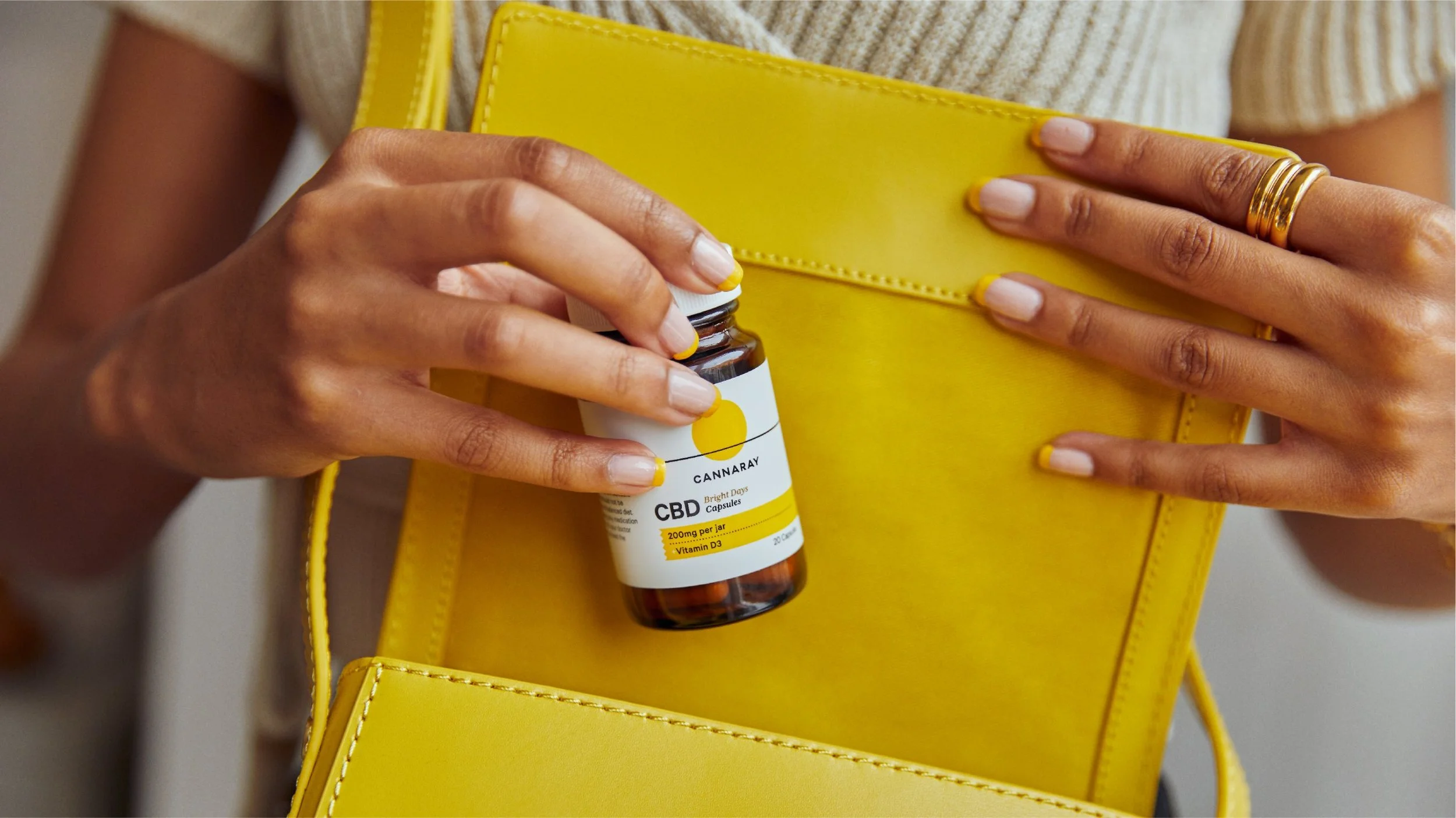
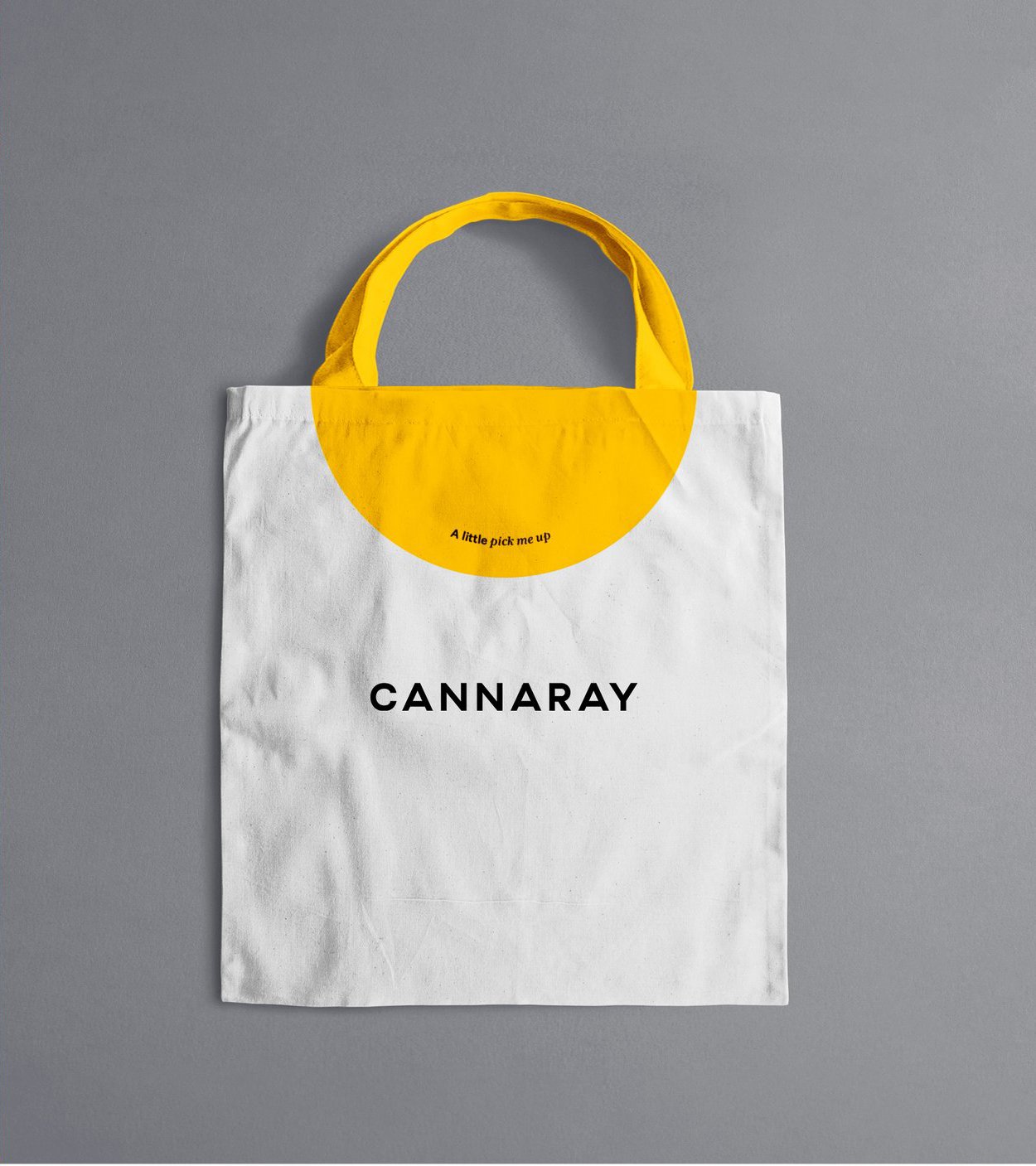
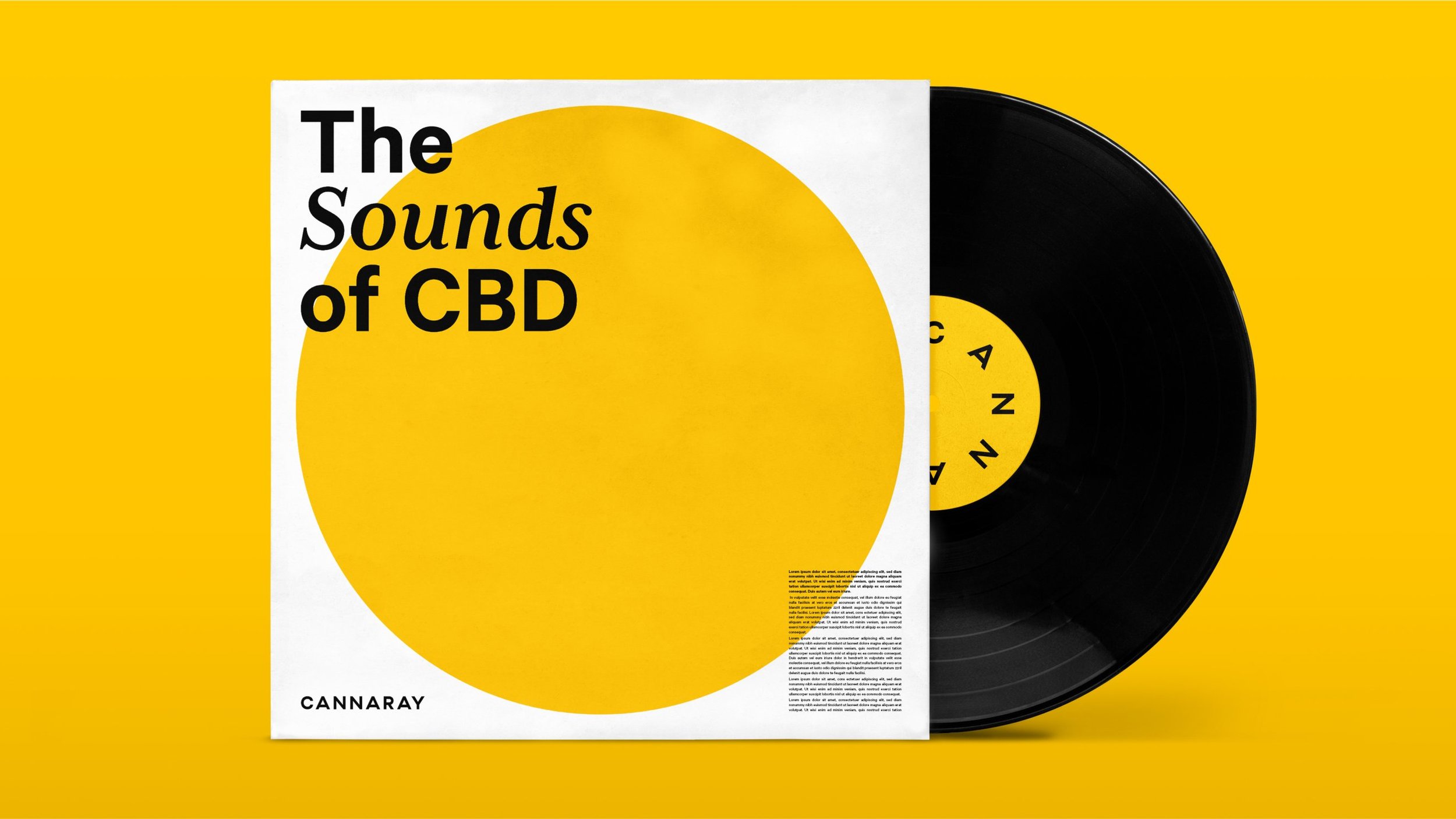
The existing Cannaray design utilised a golden circle as its icon. Whilst this felt bold and premium, it lacked warmth and created barriers in a category where permissiveness is key.
By enlivening the colour palette and liberating the circle, we elevated a simple dot into a dynamic and salient rising sun.
This forms the heart of a flexible design system, balancing positive emotional energy with an efficacious visual tone, reaching out to consumers who need a holding hand as they discover the potential of CBD.
Skillset
Identity
Brand Design
Packaging
Feel okay, day by day
-
In the early 2020s the UK CBD market was evolving rapidly, with innovative products hitting web stores and supermarket shelves with increasing frequency.
Working with strategic partner BigSmall, Cannaray sought to position itself as the first mass CBD brand, endeavouring to define the category as it entered the mainstream.
How can you use design to help fulfil bold ambitions in a nascent category?
-
The existing Cannaray design utilised a golden circle as its icon. Whilst this felt bold and premium, it lacked warmth and created barriers in a category where permissiveness is key.
By enlivening the colour palette and liberating the circle, we elevated a simple dot into a dynamic and salient rising Sun.
This forms the heart of a flexible design system, balancing positive emotional energy with an efficacious visual tone, reaching out to consumers who need a holding hand as they discover the potential of CBD.
-
Identity
Brand Design
Packaging
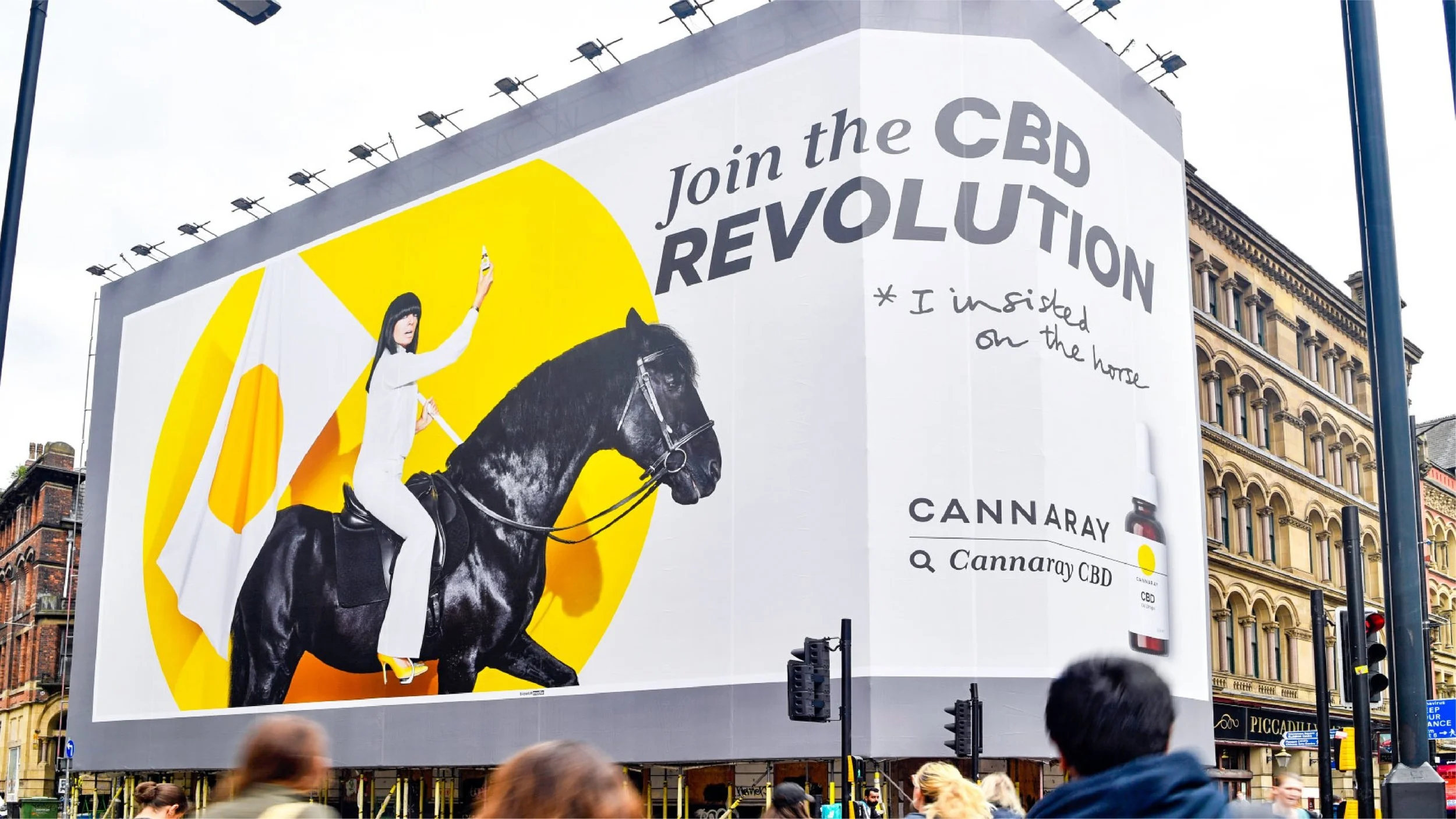
Impact
Trading
+11%
Q1 2022 trading running 11% ahead of budget.
Visibility
+1000%
Web traffic up 1000%.
Order Value
+64%
Average Order Value through eCommerce up 64% since launch of campaign.

“We are delighted with the progress of Cannaray’s CBD revolution in recruiting new consumers to CBD. Cannaray’s website sales have increased fivefold since 2021.”
Tim Clarke
CMO, Cannaray


Recognition
Partners
Client: Cannaray CBD
Agency Lead & Advertising: BigSmall
Strategy: Silas Amos
Photography: Cannaray CBD
Related projects