
Naughty & Nice
Challenge
Launched in 2010, Metcalfe’s were well positioned to take advantage of the ‘permissible snacking’ boom, reframing traditional popcorn as an everyday ‘skinny’ product for increasingly health-conscious consumers
Since then, the category has become ever more competitive, with new to world products pushing their potential to deliver lighter snacks that make no compromise on flavour, leaving Metcalfe’s feeling a bit left behind.
How do you revamp an identity to deliver the best of both worlds?
Solution
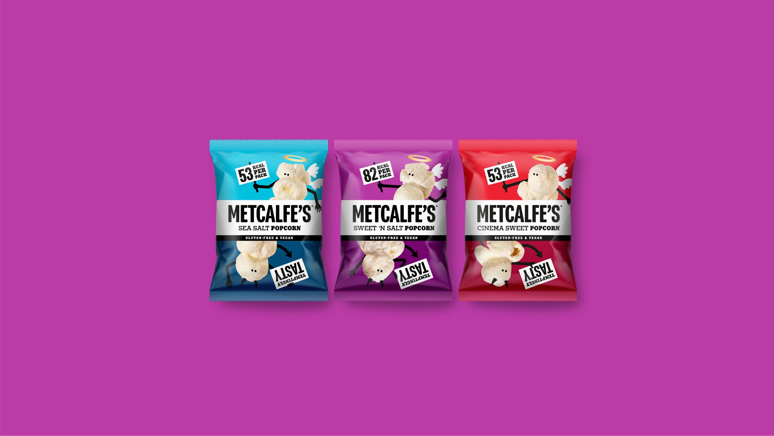
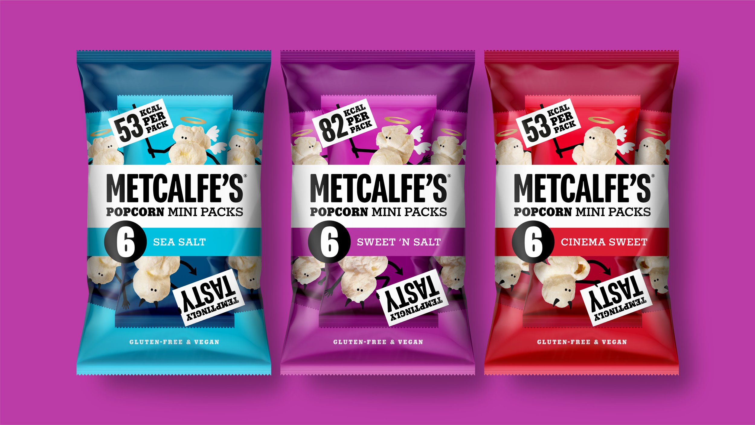
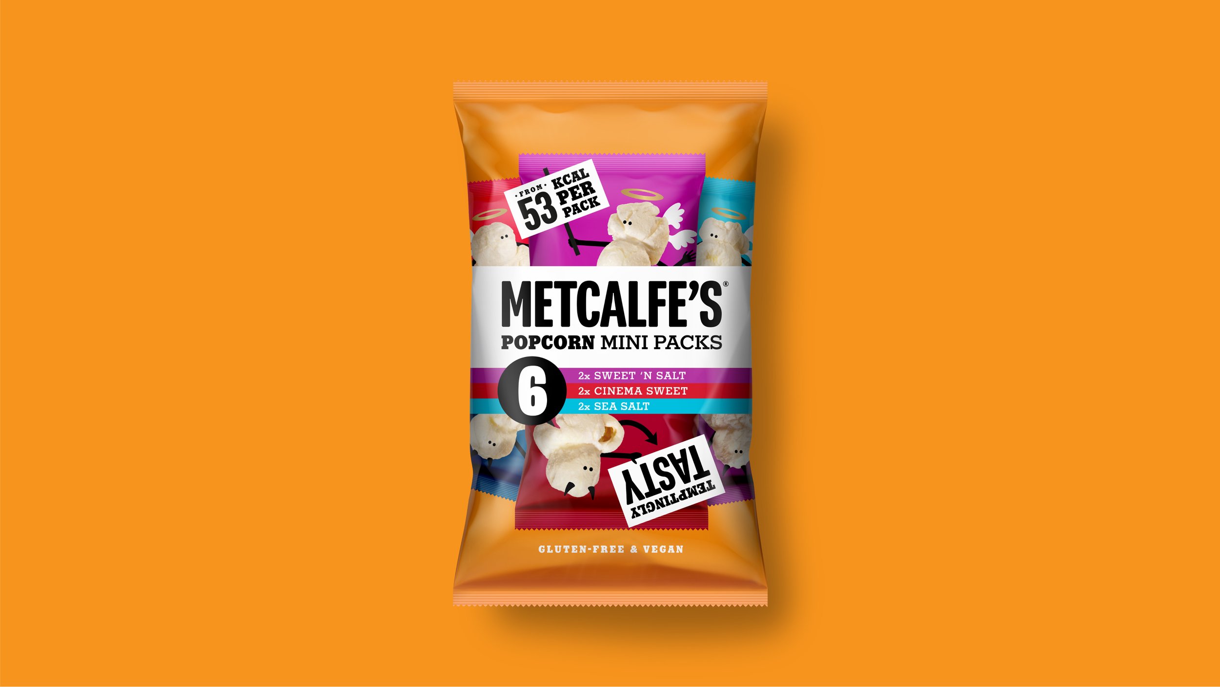
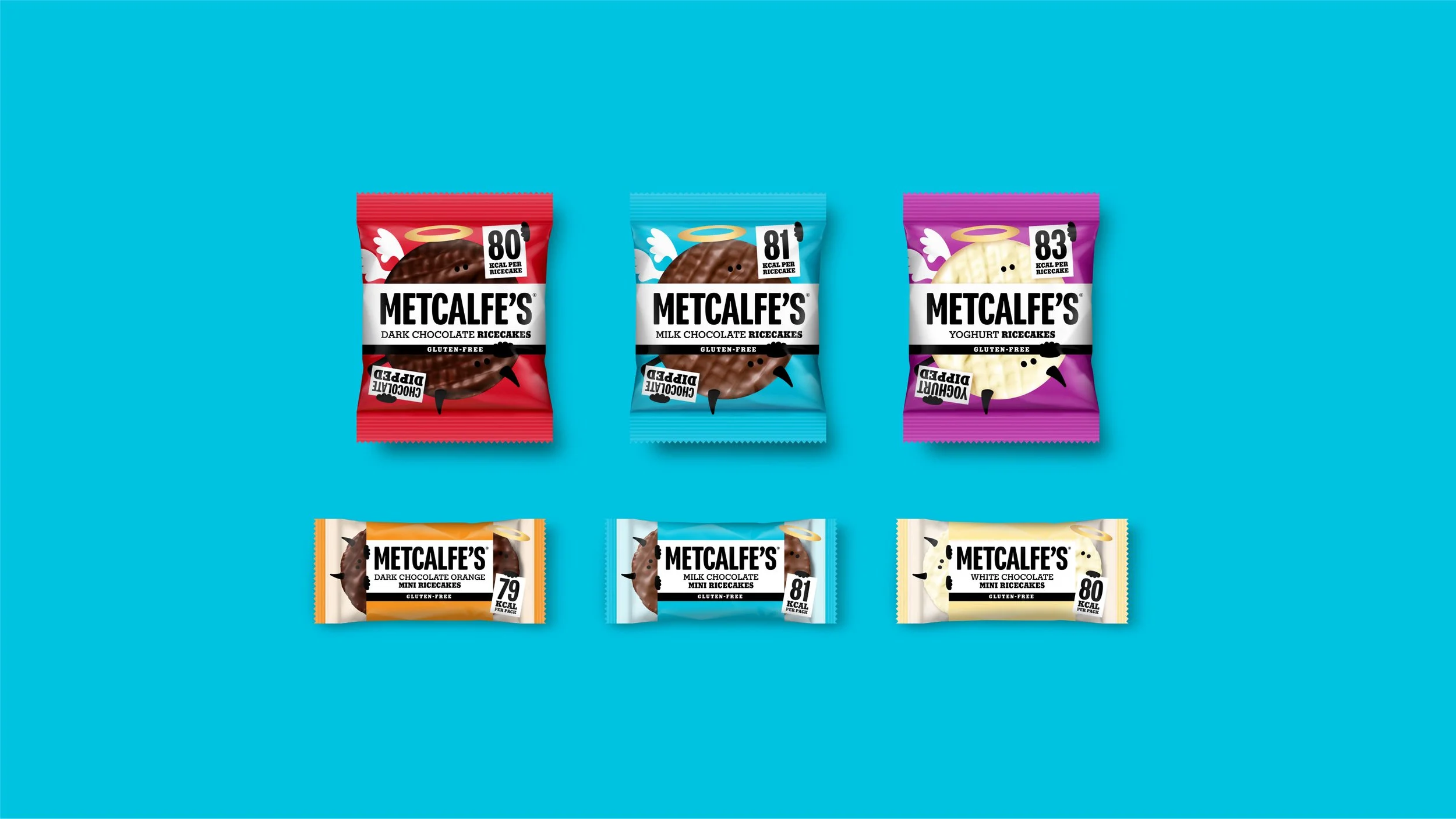
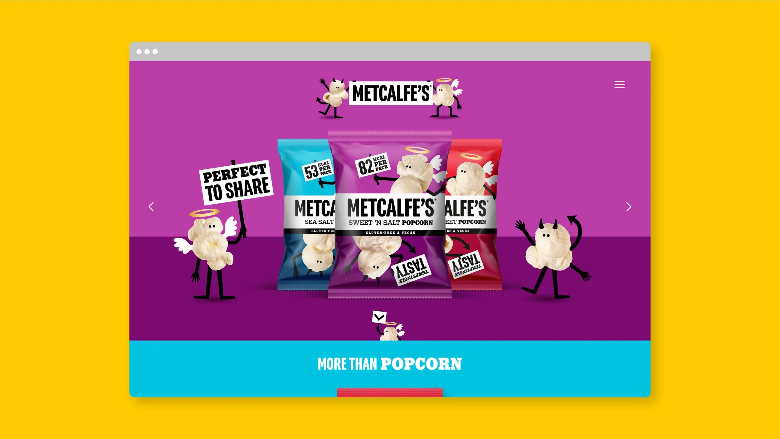
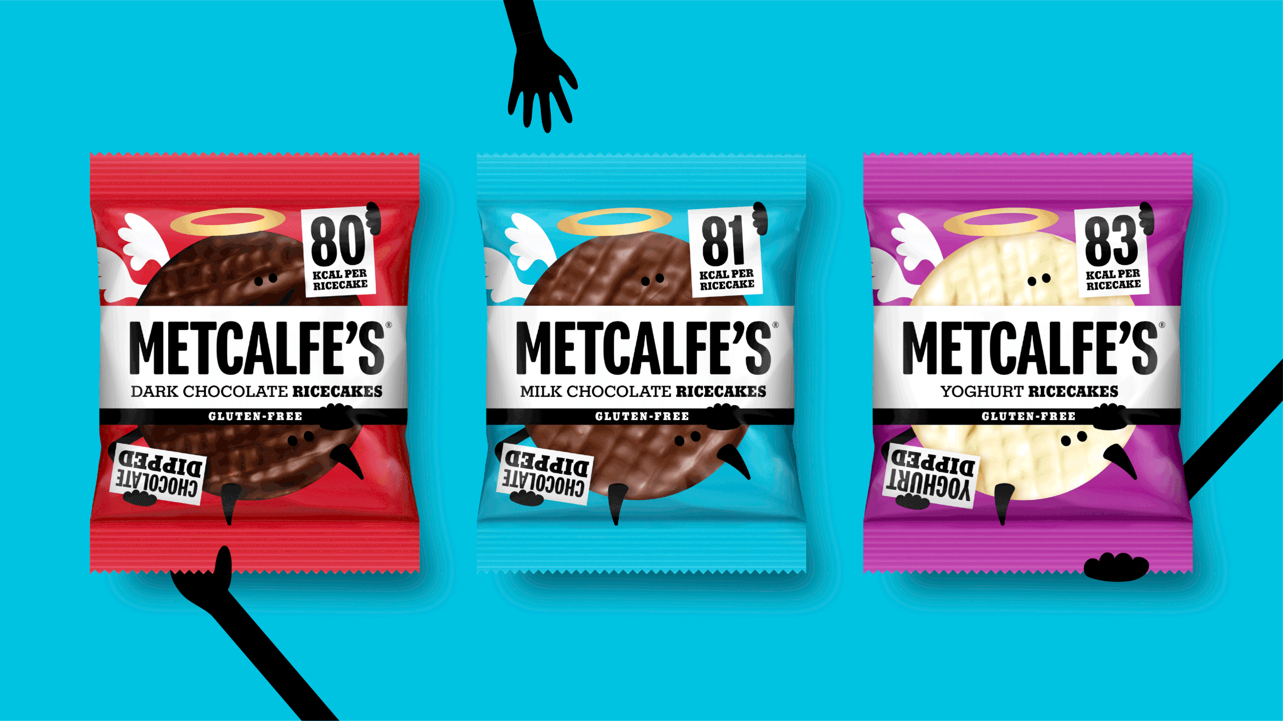
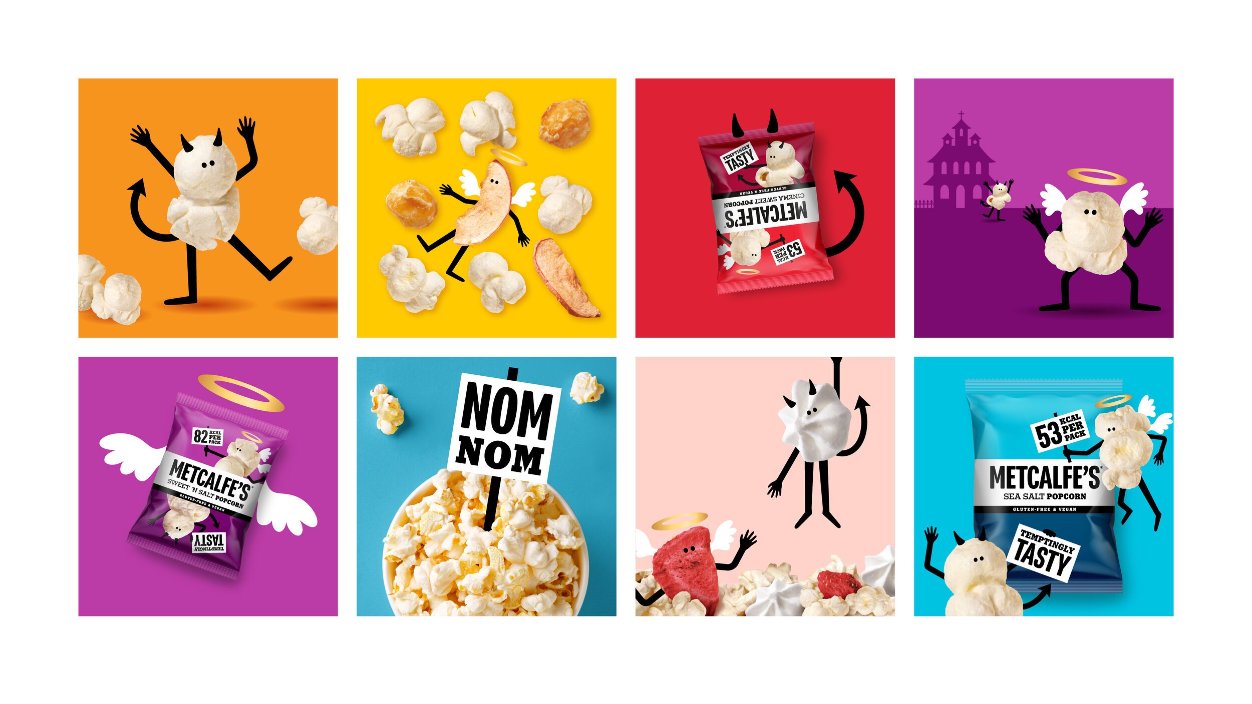
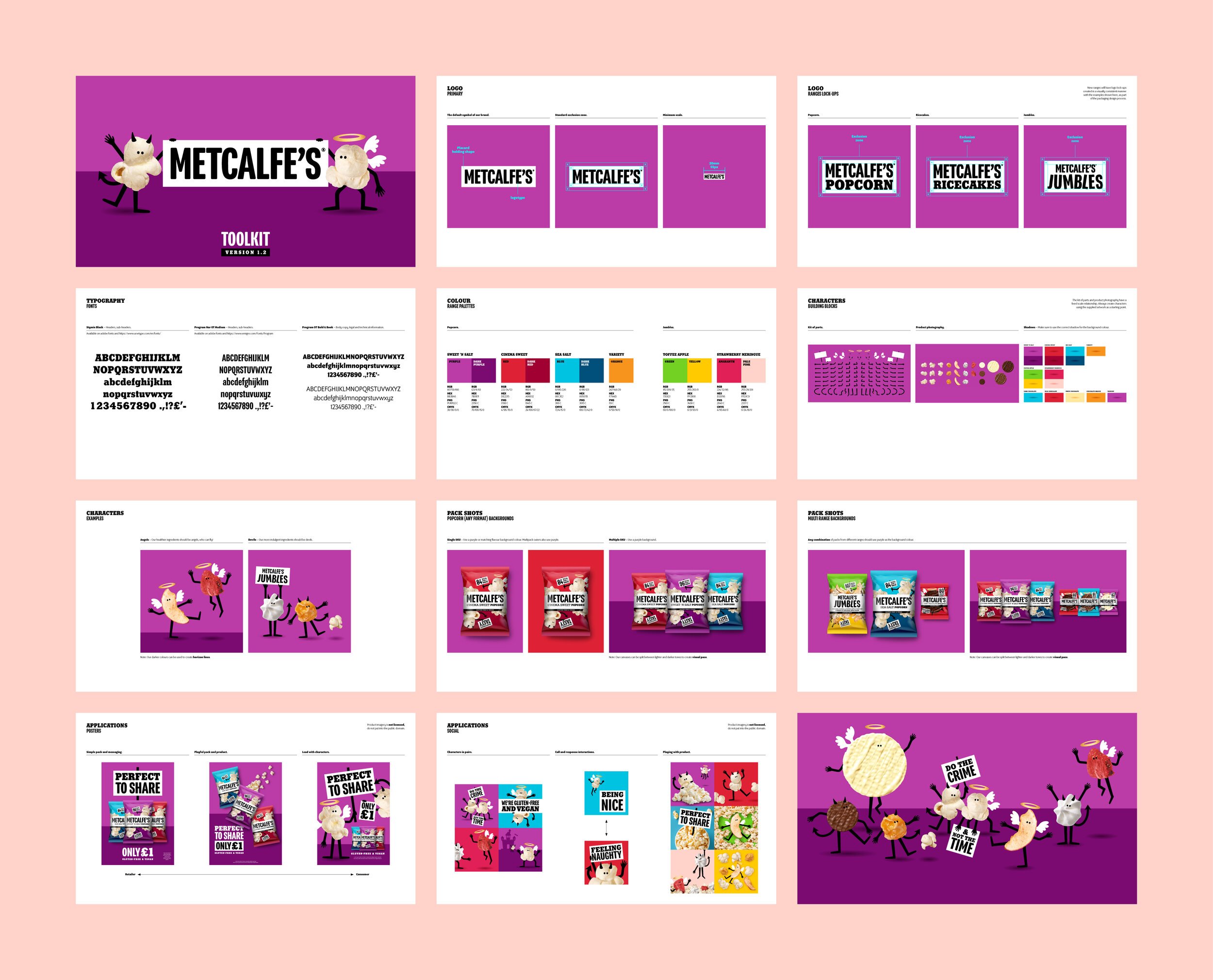
The existing design featured a world inhabited by placards and little popcorn characters, which were cute on close inspection, but lacked visual presence and purpose.
We elevated these elements by giving them a bold new style and a reason-to-be.
The Naughty & Nice characters form a dynamic duo, spelling out Metcalfe’s dual benefits; deliciousness without the guilt of high sugar, fat, salt or calories.
More than a packaging detail, they interact and move in a light-hearted manner, forming the core of the brand’s messaging through all channels.
Partners
Client
Kettle Foods
Strategy
Silas Amos
Animation
Dan Kennington
Production
Lisa Stillman
Artwork
Steve Burdekin
Project Management
Shiran Shaya

From day 1 of working together, Derek&Eric showed their ability to truly understand our brand and the objectives we were trying to achieve.
Using a mixture of their own expertise and bringing in functional specialists, the whole Derek&Eric team worked seamlessly to create a great new identity for Metcalfe’s.
I would recommend them to anyone who is looking for a creative agency to make a real difference to their brand.
Sarah Hendon
Metcalfe's Brand Manager